
 I think it’s important to point out that in the first issue of PiQ, the magazine calls its readership the following names: nerds, dorks, geeks, freaks, maniacs, and pervos.
They seem to mean these little bon mots with affection, but it does tell you quite clearly what the editorial staff thinks of its readership. Of course, the new magazine from ADV (nascent anime and manga publisher) is meant to replace Newtype USA, their former chronicle of otaku culture with a name and content licensed from the original Japanese Newtype magazine, and so some recognition that it is the hardcore fan who may be used to such derisive terms may simply be a way to ingratiate itself to the new readership. But it’s going to take a lot more than saying that we’re all nerds together and adopting the tagline “Entertainment for the rest of us” to convince me that they have anything to say, let alone that we’re all alike…
I previously covered PiQ magazine when I got my hands on the press-kit for the magazine prior to its release. The press kit broke down the aims of the magazine and their demographics quite clearly: they want men age 18-34. I’d say the magazine delivers on that promise, though they don’t quite realize that not every man in that demographic is interchangable…
I’m going to be upfront and say that I disliked the first issue. I’m not going to string you along listing good and bad before revealing my ultimate conclusion; PiQ Magazine #1 wasn’t very good. That out of the way, PiQ does have strengths to recommend it, and a lot of potential, but going by the first issue they’re going to have to work awfully hard to achieve any measure of success. It’s incredibly problematic and likely quite rushed, and with a lot of former Newtype readers already very, very angry at them, they’re going to need to improve, and quickly, to get a chance at long-term survival.
I’ve written an incredibly thorough page-by-page analysis of the magazine. It’s taken days to actually put it all together. I’ve included it behind the cut because people browsing here probably have no interest in a 6500 word essay on a magazine that they will never read, but when I say POST MORTEM I actually mean it. I am digging through the entrails of this thing CSI-style to find out what they’re doing and why. Don’t say I didn’t warn you, and you probably shouldn’t bother reading unless you’re really, really interested in the subject.
With that, click to continue:
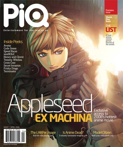
COVER: The lead feature is the recently-released Appleseed Ex Machina, a 3d animated film based on the works of Masamune Shirow (Ghost in the Shell) and directed by John Woo. It’s an appropriately exciting cover, and relevant to the target audience.
The next thing I notice on the cover is the “Inside Peeks” under the magazine title, which is a contextless laundry list of properties covered: “Avatar, Code Geass, Speed Racer, Terminator!” Similar schizophrenia dots the rest of the cover, THE LIST: “10 best anime, comics, games, movies of the month.”
The rest of the cover text makes no impression on me.
Font: PiQ is using the most popular magazine font of the day, ITC Officina. I’m not sick of it yet, it’s a nice font and I actually set my first book in it (PopImage Volume One) years and years ago… I know that fledgling comics magazine Comic Foundry digs on the Officina as well and I find it popping up with greater regularity… It’s not like the relatively-awful “Technical” font that was driven into the ground in the late 90s (or Comic Sans), but I’d personally want to launch a magazine with something a bit more distinctive. (If you check out the ITC website, Officina is listed as their most popular font.) (They also seem to be using ITC Conduit as their display lettering, which is another of ITC’s most popular fonts).
Price: The $6.99 price point seems about right for a 128 page magazine, though for the general-interest audience they’re shooting for it seems a bit expensive and a bit thin when compared to some of their contemporaries. The saddle-stitched (flat) binding also makes the book feel significantly slimmer than its predecessor which was stapled, and a little bit more bulbous, if that makes sense…
Advertising: PiQ #1 is a 128 page magazine, that includes 22 and 1/3 pages of advertising. By my count, at least 6 of those pages are house-ads or co-op ads for parent company ADV, meaning around 14 and 1/3 pages of ads were sold. I don’t think that’s too shabby, though it’s important to note that a) every singly advertisement sold is for anime product, so far as I can tell, and that’s a direction that the editorial staff are admant about moving away from, and b) Protoculture Addicts #93 did 16 pages of outside advertising in it’s last issue and it’s got a much, much smaller circulation than PiQ, and a smaller page count, and c) the February 2008 issue of Newtype included 23 1/3 pages of advertising that weren’t related to ADV in any way, which is a pretty big drop (and loss in the number of different advertisers).
Of course, PiQ #1 features a 16 page preview of the new Crayon Shinchan manga from DC Comics’s CMX imprint, where issues of Newtype usually featured manga published by ADV. That sort of outside advertorial content is generally paid for, though I’m not peeking into their accounting or anything so who can say? They might have actually increased advertising revenue…
What is clear is that not all of their advertisers have gone along with the change in size, focus, and format, and so far as I can tell the magazine features no new advertisers either… Here’s hoping their advertisers enjoyed the first issue more than I did for the sake of the health of the magazine.
PAGE BY PAGE BREAKDOWN OF PIQ:
It’s at this point I start doing a page-by-page rundown of my thoughts on the magazine. Join me as we journey through the beast…
Page 2: The letter from the editor is kind of awful. I hate it when marketers (and let’s not kid ourselves, the people producing this magazine are marketers, selling popular culture and hoping to sell adspace to go along with it) try and tell me who I am: YOU HATE YOUR PARENTS! YOUTUBE! RETRO GAMING! TEAM FORTRESS 2! PLANETES! (really, Planetes?) According to the editor, “You’re not ‘normal’. That’s why PiQ is entertaiment for the rest of us. Video games, movies, TV, anime, comics…” Are you… f’ing kidding me? Video Games, Movies, TV? This is the way in which we are abnormal? And then the “Editor Guarantee”, where he promises to never use “made up” words or to use language in an interesting way… Just what I was looking for, a boring, consumer-focussed way to express my individuality.
Uggggggggggggggggh. This is the first piece of writing, from the editor, on the second page, and it’s awful. This will not end well.
Page 4 & 6: The contents pages/masthead are actually quite attractively designed, with big, clearly reproduced and well-chosen art. The masthead still has Gary Steinman listed as publisher, although he’s left the company already. Also interesting, PiQ is not published by ADV, but by “PiQ LLC” which has… the exact same address as ADV. Quite the arm’s length they’ve got there, it may actually be an arm’s length.
Page 9: The first section of the magazine is “Peek”, which is not defined in any way or introduced with much fanfare, just a little tag in the upper outside-corner.
The first article? It’s on the new video game Final Fantasy Crystal Chronicles for the Nintendo DS. The body text and header/pullquote text all looks quite nice lying on the page, though the font size feels a little bit small for some reason. Perhaps I am getting older. You know what’s weird though? The lack of any sort of easy-to-read information about the game…. like a little stats box that lays out the availability, format, system, price, etc. Also, one assumes that “peek” has a sort of forward-looking mandate, getting a “peek” at something forthcoming or newsworthy. But the article says that the game drops this month… Strange lead.
This page also introduces the “also” sidebars, where short stories are detailed. The text is smaller still, though it’s an attractive-enough graphic.
Page 10: Articles on this page include advance buzz for the Vertical’s Dororo by Osamu Tezuka coming in April, and a sequel to the popular anime “Kite” coming… in March. Maybe I don’t get the point of the “peek” section, it would’ve been nice if they’d explained it to me a little? Anyhow. I think that it’s important to note that there’s nothing immediately explaining what anything on the last couple of pages is. Nothing that says VIDEO GAME or MANGA or ANIME. I can’t tell if this is an attempt to give the reader a lot of credit for being willing to read each article (or knowing all of this ahead of time), or is just really badly executed.
Also, the sidebar on this page talks about the HD-DVD/Blu-Ray wars as an ongoing concern, which is kind of amusing.
Also, the article on the “Kite” sequel makes a point of not having a point of view on the controversy surrounding the original. I guess it’s much harder to alienate people if you don’t have an opinion, but why am I reading you if you don’t have an opinion? What do you have to offer that a listing in a catalogue does not?
Page 12: The sidebar features a paragraph describing this month’s hot new video game releases. This is very weird, as this is information that would be better served by a chart, or a feature article, or some art maybe? It’s awkward to read too.
The main article on this page is decent, a list of upcoming titles from game publisher “Atlus” and their concerted effort to bring quirky, unique Japanese games to North America. It’s all “What” though, no “Why”.
Page 14: Look, it’s an article on Sweeny Todd? Coming on DVD April 1st. Again, the technical info is all in the article rather than pushed into it’s own section or graphic, which would’ve have been much clearer. Actually, I just figured out why this is bothering me: it reads like a press release from the company. “Sweeny Todd is coming your way on Blu-Ray and HD-DVD April 1st, just the way director Tim Burton wanted it!” or whatever. It’s awkward, an advertorial voice that is unpleasant to read.
Also this page, Comic Peeks, an additional sidebar design which features the new Serenity series, the new Morrison Batman arc, and the Hellboy Companion book, in a bit of writing too small for their main article design and too big for the sidebar… Awkward.
Page 15: A mess. An article on the new Sam & Max graphic novel uses the cover from the first edition, there’s a 1/3 vertical page advertisement unbalancing the design, an “also” sidebar disappearing into the binding, and a headline set into trapped whitespace with a hyphen in “High-way”. Ugly and poorly designed.
Page 17: It’s the “DVD Hoedown”, a named subsection within the Peek section, which reviews DVDs. Except it isn’t really “reviewing” them so much as mentioning that they have come out. Again the technical info is in the body text making for a weird advertorial voice, the product images are tiny, there’s a design here using coloured (CMYBrown, which is lazy AND strange) bars and white space and text set on top of the coloured bars that is alternately aligned to or a pica off of the edges of the bars… It’s all just very poor. It looks like it was done at the last second, and the design elements in this section don’t actually repeat anywhere else in the magazine adding to the slap-dash effect.
Oh, and there’s a review of “Tim and Eric Awesome Show: Great Job!: Season One, which I thought they specifically said they weren’t doing?
Here’s another odd thing, the DVD review section goes “Hollywood Blockbuster Film, Anime Box Set, TV Box Set, Hollywood Blockbuster Film, Adult Swim Box Set”. It feels like no consideration has been put into how the information is laid out or to be received by the viewer…
Pages 18-25: Here we go, the main event! The cover feature on the new 3d animated APPLESEED feature. It starts off promisingly with a well-written introduction to the Appleseed universe and the history of the animated films, a nice few paragraphs that bring us up to speed and get us hooked on the story. “An introduction,” one might say.
Page 20 begins the main article, I assumed at the time. But the type has JOHN WOO in great big letters and this page features an interview with John Woo, which is interesting enough… it’s a little blandly told, focusing more on Woo’s business acumen than his creativity… I wonder who the audience is for this piece? At any rate, the single column of text runs 6 paragraphs of Woo interview and advertorial background information, and it runs just right-of center the left-page of the double page spread, the rest being taken up by a pull-quote and some screen-shots of the film. And a big photo of Woo. One assumes, as the photo is neither credited nor captioned.
So when the next spread features a similar layout, with a single column of text that begins with an unindented paragraph and a big bit of text that says MASAMUNE SHIROW at the top, I assume that it’ll be an interview with Masamune Shirow. It is not. It is more article, I guess? I guess the John Woo interview was not an interview on its own but the next part of the article, even though it read (and was designed!!!) as a self-contained interview. So this one is Jonathan Chou (who isn’t re-introduced in the text, which is also a bit confusing, I had to go back and check the previous spread to see who he was) talking about Masamune Shirow. Which is both misleading and less interesting to me.
The last page again starts with an unindented paragraph and a big name, JONATHAN CHOU. The co-producer of the film (and one of the fellows involved in the “Animatrix”) actually gives an interview here and this part of the article is centered on him (and ends with him). So what was going on with the Shirow spread? Did he drop out of the interview after the pages had been designed or something? It’s really awkward to read thanks to the design, and the feature itself seems pretty confused with the text broken up artificially into 2-page spreads..
Oh, and you know what else is annoying as heck? None of the articles have an “End Sign”, that little dingbat graphic that most publications put at the end of their text to signify the end of an article. So after each article sort of ends and then restarts on the next page, I’m kind of expecting another double-page spread of APPLESEED, but instead it launched into something else entirely. This is really, really weak on their part.
Page 26: Our next feature article is on “Crisis Core: Final Fantasy VII”. There’s a big pretty CG render at the top of the article of a pretty anime boy. Now here’s the thing, without reading (rather than skimming) the body text or being in-the-know, there’s no way to know what CC:FF7 actually is… The Final Fantasy brand extends into almost every facet of pop-culture, and it all looks really samey. I just noticed that the info box (which finally makes an appearance) mentions PSP, but again, there’s no context… It’s just poor information design.
The sidebar for this article mentions that Crisis Core is part of the “FFVII Completion Project” and mentions that with the release of this game there’s now only one game from the project that hasn’t been released in North America. All well and good, except it doesn’t mention the status of the other “Completion Project” items that span films, anime, and other video games… It’s a real missed opportunity to do something genuinely informative and interesting.
Also: I found this piece a little mealy-mouthed, afraid to have an opinion on the work. It almost contradicts itself in it’s “this offers something new that will bust it out of the RPG mold!” opening versus it’s “this is an RPG for RPG fans!” closing, and even then it reads more like a review than a feature article…
Page 30: The Speed Racer… whatever this is. Preview? Review? Feature? It doesn’t really say much. I think it’s supposed to be a comment on the mixed fan reaction to the visual look of the trailer, but at 4 paragraphs it doesn’t develop into much, or quote any of the sources its referencing about that mixed reaction. It’s like a lazy blog post.
Page 32: A feature on Marvel’s forthcoming SECRET INVASION mini-series. This is the best-written and most interesting piece so far, featuring an actual interview with writer Brian Michal Bendis, some interesting art, and two decent sidebars. Unfortunately the sidebar that’s a timeline of the history of the Skrulls of the Marvel Universe is pretty boring, a missed opportunity to add some visual interest. This article is the minimum standard I expect from a “feature” and it makes much of the other material look underwritten by comparison.
Page 36: On that note, this “feature” on the xxxHolic anime series feels like it has no content whatsoever. It’s a plot recap. Actually, there’s a sentence or two recapping the business deals surrounding its move from manga to anime, and from Japan to the U.S. Is there some top-down editorial verdict that none of their writers are actually allowed to talk about the quality of something? I mean, the closest this gets to expressing any sort of opinion at all is “Regardless, the series has become an overwhelming success…” whilst talking about a series that is at least theoretically debuting this month and again, not quoting anyone or (I feel) supporting that assertion. Again, I can’t tell what this is supposed to be. A primer on xxxHolic? A review? Advertorial?
Page 38-43: This feature on the popular animated series “Avatar: The Last Airbender” actually feels like a feature, and the piece even has an authorial voice that isn’t “buy this!” which is a really nice change of pace. Author Paul Starr interviews the creators of the series in an informally written style that directly addresses the reader and their possible bias against the series because of it’s anime look but non-Japanese origins. While the style of the writing isn’t to my personal taste, it’s competently written and informative.
The design on the other hand, is weaksauce. This article suffers from the same problem as the APPLESEED article, only moreso. The initial double-page spread features an introductory piece that explains the series, and then continues into… a double-page spread of profiles of the main characters in the series, sidebar entries blown up to two full pages of content (six medium-length paragraphs spread out over two pages with character art). Not only is it badly designed and presented, it also breaks up the flow of the feature article something fierce. If I were the writer I’d be pretty pissed myself… unless in this instance the first double page spread WAS it’s own article, followed by another “article” profiling the characters, followed by another article interviewing the creators… In which case: yikes… editorial misfire there.
Also, the design of the last spread is really… overthought. I don’t know if their designers can tell the difference between visually interesting and just too much. Trapped white space, too much white space… It’s all a bit… much. The choice of pullquote was kind of odd too.
Page 44: The next double-page spread is titled “the zen of n” about a video game called “n”. It’s pretty well written and I came away feeling like I knew something. It’s also important to note that the name of the thing that they’re talking about is in the title, and that the sub-header clearly explains what the article is about. This works exactly like a headline and sub-headline are supposed to work. This is important, because the xxxHolic article buried the title of the anime in the body text, and:
Page 46: A double page spread entitled “Viva la Revolution!” with no sub-headline, and an article that starts off with an icon that says SPOILER ALERT! So if you were just browsing this issue you would see an article about what looks like an anime (but given the nature of contemporary pop-culture, something that looks like anime could actually be anything, a video game or manga or movie or whatever) called “Viva la Revolution” and you can only read about it if you want the series’ plot twists spoiled for you. Weak.
Except that the feature is actually on an anime series called “Code Geass: Lelouch of the Revolution”, and that is not mentioned until the second paragraph of body text. Even the “Vitals” box doesn’t mention that this is an anime, or that it’s a tv series versus a movie or anime. Or it’s name.
The feature itself is well-written enough (although they have buried the lead in a rookie mistake). The sidebars are informative too, explaining what a “Geass” is. Still no “End Sign” anywhere in site, so when I flipped to the next page I was expecting more Code Geass info, and instead got:
Page 50: A feature article on the new “Terminator” television series. It’s a fun little comparisson between the timelines of the various Terminator films and the new TV series, and how none of it really “works”. Fanboyish, sure, but exactly the sort of article I assumed I would get from this magazine. My only complaint is that the article starts off with a quote that isn’t actually quoting anything, which the authors describe as a “common refrain.” But if it was that common, source the quote, and if not, it’s easy enough to re-write the opening.
Page 54: Double page spread of the new Honey & Clover live action film by Viz. The design is a little overly-ambitious again, and doesn’t quite come off, but it’s alright.
Page 56: This is sort of a strange one. This spread is designed to look like a feature on “The Tin Man” (though again, it doesn’t mention that in the headline or sub-header). Except the “feature” is three paragraphs. And the “sidebar” is an interview with one of the characters that runs 2/3s of a page.
I think it’s fairly safe to say at this point that the design and content are just poorly integrated across the magazine.
The interview itself is kind of sad, the interviewer asks if “The Wizard of Oz is as huge in Canada as it is here?” which is… are you kidding me? There’s also a question where the interviewer can’t seem to tell the difference between an actor and the character the actor plays, and the interview subject is kind of like “Are you kidding me?”. Both the reader and the interview subject being incredulous at the questions of the interviewer is a poor recipe for success.
Page 59: The beginning of the promised cover feature, “LIST:”. It’s important to note that LIST: is the only section in the entire magazine that gets an introduction. I am glad that they bothered to explain that this is their reviews section, though they take great, great pains to let us know that they’re not the final arbiters of taste, and that their opinions are only their opinions, and please keep advertising with us if we don’t like your comic/game/anime/movie/book. You think I’m probably just being mean at this point, but seriously, this is in the body of the text:
“There’s no point in trying to stay abreast with everything coming out. It’s impossible. And more to the point, it’s impossible to pretend that one magazine can be your ultimate, infallible resource for everything cool under the sun. We may be fancy-pants salaried editors, but printing a magazine doesn’t instantly make us the Wizard of Oz, dictating to you what’s cool and what’s ridiculous–the Internet pulled the curtain on that ruse years ago. … Every month we’ll sit around a table… and draw up a list of the ten new things that we like the most.” – PiQ Magazine #1
So there you go, their review section is comprised of 10 things that they really liked, and even then if you don’t like their opinion, they’re very sorry. This is, seriously, followed up by their review guidelines:
“PiQ’s Rating System. If we use words like “neat,” “engaging” and “spanklicious” in our reviews, that means we liked it. If you see terms like “nasty,” “boring” or “They raped my childhood!!!”, that means we didn’t like it. Our reviews are our opinions–we’re here to tell you what we like, not what you are going to like. Keep that in mind as you have fun reading about neat stuff. (If you like numbers, we hear Will Shortz has a delightful selection of sudoku books out now.)”
Dude. Dude. Points for doing away with a numeric rating system, but that’s just sad. Anime fans are ‘passionate’ and all but that doesn’t even sound like you’re standing behind the opinions you’re expressing, even though you’ve already said that you’re only going to be talking about things you like! Weak.
Also, “spanklicious” would seem to be the exact sort of made-up word that the editor promised on page 2 that they would not use… Three cheers for a consistent vision across the magazine…
Oh, and then there’s this, also from the introduction to the LIST section:
“Anime, video game, TV show, book, manga, comic… in a way the format doesn’t matter as much as it used to, because you and I, we’re interested in all of it.” – PiQ Magazine.
I’m sorry, guys, you’re just wrong. I agree that your readership likely has a wide variety of interests that generally fall under the banner of “nerd stuff,” but that’s no excuse for just slapping content onto the page, or making no effort to be clear about what you’re actually reviewing (seriously, the lack of categorization on the pages themselves is almost pathological).
Point blank: The PiQ editorial ideology is out to lunch. Do you want to know why? It’s because Otaku may like lots of different things, but they’re obsessive-compulsive about the organization of those things. I know I am. I know my customers are. I know the internet has wide-ranging fights about the exact definitions of terminology related to their hobby/lifestyle, and how individual items within that hobby should be classified. This is all fact. Actually, I’m going to enter the following into evidence; it’s an interview I just conducted with one of our better customers and a friend of mine. Enjoy.
Interview with an Otaku
Christopher Butcher interviews Derek Halliday, admitted multi-faceted Otaku and squarely in the middle of the 18-34 year old demographic for PiQ. Derek can be found on the internet at http://halliday.livejournal.com/
Comics212: Did you collect NewtypeUSA when it was coming out?
Derek: I didn’t really collect Newtype, but I would pick up issues where they had stuff I wanted to see in it. It was alright. It’s basically exactly like the Japanese Newtype, but more about what’s coming out here.
What did you think of PiQ?
I started flipping through it, and became bored almost immediately.
I didn’t like how it was all over the place without… you know. There’s 4 articles about anime, but it’s spread throughout the book, between the comics and the video game stuff. I just felt that if there’s one thing you wanted to look at you had to jump all over the place.
What kind of stuff do you collect?
Uh… comics, anime, manga, dvds, toys, art books… Considering all of the other shit I collect I just can’t afford to collect video games anymore. But I do like them and follow them… I just can’t keep up with it all.
Do you organize them or do you just sort of keep everything together?
I put all my American comics together, and then they’re sorted by which company they’re from. All of my manga is organised by title or artist, and my anime is all together.
But those things aren’t mixed together?
No.
Even though you collect all of them, and are interested in them.
Yep.
What about your anime and your other DVD stuff, do you keep that together?
My anime is completely separate from my other DVDs. My TV DVDs are separate from my movies… I just like to categorize things.
Me too, buddy.
Thanks for participating Derek!
So what have we learned here? Slapping down the content in your review section (not to mention throughout your magazine) all willy-nilly is not cool just because someone might conceivably buy both “Tweeny Witches” and “Patapon”. We all like all of this stuff, but we don’t just cram it all onto the same shelf in our homes or collections, and it makes for a poor reading exeprience.
How could the editors of a magazine for Otaku not understand the first thing about Otaku? They’re all (hell, we’re all) obsessive compulsives.
Alright.
Moving on.
The review section is fairly well written, though a little bland and as worried, nearly uniformly positive. Any problems with any of the featured items are quickly contextualized, and most of the reviews are mostly plot recap anyway. It’s pretty much the definition of contemporary reviewing, and perhaps it’s just unfair of me to hope for something more. Standout reviews include The Ten-Cent Plague by Ellen Wernecke and Apollo Justice: Ace Attorney by Kevin Gifford, which offer rounder views of their subjects and deeper insight into their histories and their cultural context.
Page 79: This spread introduces a new section, “LINK”, with the letter column. It’s called “The Whine and Cheese Party” and I can’t tell if that’s clever or insulting. They take the curious task of having the guy who answers the letters introduce himself, meaning that it is not the PiQ editorial staff who is responding, but one specific guy at the magazine. Perhaps it’s cynical of me to assume that they will hang him out to dry at one point, but considering how reticent they are to weigh in on anything and that this guy comes off as fairly combatative (he describes anyone who complains in a letter as a “player hater”). I guess that it’s okay to have a vocal opinion about your readership, they aren’t buying ads [cheap shot]. From a design perspective, there’s not enough difference between the text of the letters and the text of the responses, which is an easy-enough fix, if they decide to fix it.
Page 80: A feature on LARPing (Live Action Role Playing) runs for four pages here… I think LINK is all about fandom, rather than about the things that fandom concerns. Yay! I figured out what one of their sections means! Three cheers for me. The feature is good enough I suppose, although I really can’t help but chuckle a little at the huge picture of “menacing” men and women pretending be vampires. I’m sorry, I really am, I shouldn’t laugh.
Page 84: A review of a an anime convention with lots of cosplay photos. Alright.
Page 86: A listing of upcoming conventions organized by date. Seems relatively useful, though I think I prefer listings by geography so I can figure out what’s in my general area, rather than simply what’s next weekend… still, hardcore fans will certainly travel to the big shows so maybe this suits the target demographic?
Page 90: The next section of the magazine is MONITOR, which I take to mean “news” and maybe something with an opinion, which is welcome.
This section starts off with an article entitled “Is Anime Dead?” which explores the trials and tribulations of the anime industry over the past few years. The article is actually a collection of essays by notable anime industry figures, and offers a variety of viewpoints on what the problems are, what’s causing them, and what might fix them. It’s actually really well done, an excellent piece of discussion, and the strongest piece in the whole magazine. It’s even sort of conceptually neat, asking the question as the magazine launches from the ashes of an anime dedicated magazine.
I’m kind of annoyed that no one in editorial or on staff comments or writes for the article though. It seems to me to be the same problem that pervades the rest of the magazine, a lack of opinion or ideology. I’m glad they’re at least presenting a platform for opinion this issue, I hope that continues.
Oh: Best part of this piece was a list of the top 10 best selling anime DVDs in Japan for 2007: Four of the top 10 discs were Western animation, including Ratatouille, Shrek 3, Cars, and “Leroy and Stitch” which I thought was “Lilo and Stitch” but maybe there was a translation error? Anyway. It’s a nice sort of kidney-punch driving home the fact that anime is having a tough go of things everywhere, not just in North America.
Also interesting: The magazine has had a pretty aggressively anti-moe (essentially: exceptional cuteness usually found in big-eyed, young anime girls) stance considering that material was the bread & butter of Newtype USA. I have to wonder if they’re really interested in retaining any of that audience at all…
Page 96: Monitor continues with an article on how the producers of the Naruto: Ninja Destiny” video game turn the fighting moves from the manga and anime into the moves used in the game. I’m not sure why this is in a “news” section? At any rate, even though it’s only 4 paragraphs it still could’ve used more than the 2/3s of a page it received as several of the displayed images measure less than 1″ x 1″ and really aren’t designed to be shown so small.
Also on this page are two Top 10 charts seemingly chosen at Random, the “Top 10 Selling Manga” (but from Japan?) and “The Top 10 Hentai DVD Names” which is funny, but racier than the rest of the content in the magazine. I’d actually prefer more lists like this in a magazine, they’re good way to get actual content and information across.
Page 98-99: This double page spread features 4 short articles of varying quality. The most disappointing is the short article entitled “Asian Invasion” on “The finest in film from Japan, China, Korea, and beyond”. All well and good, but the article again featured no info graphics at all, and therefore had no information at all on any of the dvds it was covering! Release, format, price, extra features, anything… the whole article takes on the tone of a conversation between two friends, and not a piece of formal writing. “Hey, you know what’s good? Zebraman. It’s totally not like Takeshi Miike’s other films. If you ever see it around you should get it.” Thanks man, that’s really informative!
“The Line Between Camp and Crap” is an interview with several of the creators of “Mystery Science Theatre 3000” promoting their new project “Cinematic Titanic” by talking about crap films. It was pretty fun, but the design is weak again, much like in the letter columns, with no easy visual differentiation between the questions and answers. The whole purpose of design is to make things both attractive and clear, it’s a pretty basic concept, and it’s not really present anywhere in the magazine.
“Signal to Noise” is, apparently, a CD review section. Why this was not included in the review section is beyond me.
“Don’t Smurf Me Bro” is an article on the anniversary of The Smurfs. It’s just weird, there’s no other way to explain it. It’s like 5 random thoughts about Smurfs, including an awkwardly quoted section from The Venture Bros.
Page 100: This double page spread features a really well-written, relatively well-designed profile on a Japanese illustrator named “Symbolon.” I found it genuinely informative, and while the sub-header has an unnecessary hyphenation in his name because of a line-break, generally, it was really good. Except.
Here, I’m going to do something that the article didn’t do: http://www.symbolon.jp/
How do you not bother to link an artist’s personal online portfolio in a spread of their work? Is it laziness, or a really unfortunate editorial mandate not to include external links? Either way: Weaksauce.
Page 102: Model Citizen, an introduction to model building. It’s well done, but it’s an ultra-basic article on model building. Appropriate for a first issue I guess, but I’m not quite sure if there is an audience that wants to build Gundam models that doesn’t already know the very basics of building Gundam models.
Page 104: I feel like I’m only repeating myself here, but this page features a profile on a Gundam-themed cell phone that doesn’t mention price, availability, or a website link to find out more info. Seriously, guys, just go buy any magazine at all (particularly something oriented towards consumer purchasing… fashion mags are good in particular) and just teach yourself how this sort of thing is meant to be done.
Page 105: A feature on kewpie dolls. Cute, nice photos, same problems as previous.
Random Observation: Photos and images in PiQ don’t have captions, credits, or copyright info. Anywhere. Isn’t that a major oversight? I mean, I find it less readable personally, but isn’t there a sort of… requirement for some of this stuff?
Page 106-109: I noticed the credit/caption thing because this article was the first one to actually include captions. They’re at like 4 point, which leads me to believe they aren’t actually part of the design ideology and were sort of jammed in after the fact.
It’s a 4 page article on the history of adventure game publisher Legend Entertainment, an early competitor to Sierra. It’s well written, designed, has great sidebars, and is ultra nerdy. Perfect article, no anime fans will care though, so again, I have no idea what the target audience for this magazine is…
Page 110: So there’s a feature called PIG. This is the last article in the magazine, and a bizarre note to go out on.
At first I was mystified that a company that only exists to sell pop-culture to its readership would move away from their bread-and-butter, anime and manga, and the vertical integration that comes with it. Especially when the first issue of that new magazine runs a cover-featured story entitled “IS ANIME DEAD?“. But I made my peace with it, because they’re clearly trying to include their anime coverage in a larger cultural context, appeal to new audiences, and move to a format that can realistically be supported by far more advertisers. Fine.
But the last page of the magazine is an opinion column, unsigned by an author and therefore coming on behalf of the magazine editorial staff itself, that outright insults their customer base for buying too many DVDs. Seriously. They spend the previous 109 pages actively trying to sell you things (yay advertisers!), and then run an editorial bemoaning conspicuous consumerism (our readership sucks!). Opposite a full page advertisement for an anime box set, an advertisement that is at the least a co-op advertisement by their parent company.
That effectively hangs an “Under New Management” sign on the front doesn’t it? A schizophrenic one that is written in those cut-out-from-newspaper-letters, sort of a ransom note thing…
Of course, it’s a pretty awful and unpollished article… and honestly a completely bizarre note to go out on. Another editorial misfire in a magazine full of them.
Pages 112-128: A 16 page preview of Crayon Shinchan manga from CMX. I like Shin-Chan so this was a fun read, but it’s miles away from any of the manga that they had been running in Newtype and I can’t see the manga/anime market caring. I suppose it’s for the audience of readers that are the “mainstream” and that watch Adult Swim, where the animated version appears. Probably a good move for CMX as an advertiser, but in terms of editorial content I can’t imagine that PiQ will get any mileage out of it… at all.
Conclusion:
Like I said in the opening, PiQ #1 is just a weak all-around magazine. It lacks focus, it’s editorial mandate is poorly considered, the design has the building blocks of quality but doesn’t know what to do with them, and a number of persistent mistakes damage the readability and my personal enjoyment of the magazine. I think it’s one thing to say that your magazine is for men, age 18-34, but it’s another thing to actually produce a magazine for that demographic. No mentions of sex or attractive women or men are featured in the magazine at all, no libido, no opinion (except that they don’t seem to think much of their readership…). PiQ #1 is a surprisingly bloodless affair, and if there’s one thing that their demographic is, it’s PASSIONATE (and obsessive compulsive…). How they missed the mark so far is beyond my reasoning, but miss it they did.
Failing a spectacular improvement between issue #1 and #2, I wonder if this magazine will be long enough to find it’s footing, it’s editorial voice, and perhaps most importantly a readership that doesn’t outright hate them right now thanks to the mishandling of the transition between the former NewtypeUSA magazine and this new endeavour. I hope they do because a venue for smart writing on pop culture is a good thing, and an editorial acumen that chooses strong, smart, and most importantly passionate articles is always welcome. There’s a lot of possibility there, and articles like Is Anime Dead? hint at what could be, but they just aren’t “there” yet and probably won’t be without a concerted effort on the editorial staff’s parts.
Good luck PiQ, you definitely need it.
– Christopher
Interesting. I flipped through it the other day but I’m not familiar enough with NewType USA to provide adequate context in a review. I will note that despite your keen eye, however, I’ve actually never used ITC Officina in any publication I’ve ever worked for. Sorry!
Tim- My memory of Comic Foundry #1 is hazy, apparently. APOLOGIES.
😉
– Chris
Hi Chris!
This is Scott of PiQ. I’m sorry you didn’t enjoy the first issue, but hopefully we can win you over in the coming months. I did want to comment on 2 things though that have come up repeatedly.
1) We have the utmost respect for anyone who would pick up our magazine and those who think otherwise are deeply mistaken. In planning and creating PiQ we made a very conscious decision to stay away from the snarky, bullying tone of most entertainment media nowadays, and every piece we write and edit keeps this in mind from beginning to end.
2) I understand that you probably wouldn’t like the first issue of PiQ whether or not Newtype USA ever existed, but I hope that over time we can overcome comparisons to it. Newtype wasn’t something that we had a whole lot of freedom in creating; it was the American version of a Japanese magazine. PiQ is completely ours from start to finish, a fact that enables the staff and contributors to insert more of their own personalities and ideas into their work. We’re trying very hard to make something brand new from scratch, and I hope we can be judged on our own merits as time goes on.
Thanks for giving us your attention, and I hope future issues are more to your liking!
Glad I could help.
After reading this, I’m totally glad I went with my initial opinion and didn’t actually buy the magazine… one of the things I liked about NEWTYPE is that, on the occassions that I did buy it, I could at least count on it to be filled with art or interesting photos I could use as reference… I found PiQ to be surprisingly bare visually… there wasn’t much to look at.
It really bothered me that they didn’t segregate their content… it was almost epileptic.
I will at least LOOK at the second issue, but, yeah, they’d have to really get their shit together to get me to actually buy it.
Chris,
all I can say is “Dommo Aringato Gosaimasu” (Thank you very much!)
I loved the article. 🙂
That’s a really thorough and impressive review, and now I can speak authoritatively about the magazine without ever having to read it! Thanks!
I do hate that attitude of “Wow, us crazy nerds who like these weird strange SF movies and TV shows, we’re so out there!” Guys, it’s called popular culture for a reason.
Sorry we haven’t been in to bug you and buy stuff lately, if we’re not unpacking boxes we’re working like crazy or buying more shelves at Ikea. I’m way behind on my comics.
Chris I have a question;
Have you seen the letter from Gary Steinman that was inside the front cover (inbetween the Battlestar Galactica advertisement). It reads “Dear NewType USA reader…”
If you haven’t seen it, would you like too?
Whoops,
I should have clarified that this letter was only sent to former NTUSA subscribers.
My bad.
Loved this article. Thank you for taking the time to do it.
Scott: Thanks for commenting. I’m honestly not sure if you’re interested in a back-and-forth here, but regardless of what you’re saying here on my blog, the magazine itself felt very unfriendly to you previous customers at numerous points throughout its articles. The slams on Moe culture in particular were the big indicators, but honestly, who subscribing to Newtype is going to be that into this new magazine? It offers almost nothing to the hardcore otaku. That in particular is not a failing on its own merits, but when the editorial staff and publishing arm is working hard to promote a connection between the two magazines (a connection you don’t seem to want), you can’t help but fail. This also leads into the second point you make: you fail on your own merits and regardless of comparison to Newtype, and I’ve tried to outline that as clearly as possible…. but PiQ is never given a chance to stand on its own two feet. You have… soooooooo much work to do. I’ve spent 6500+ words detailing the successes and failures of this magazine, and to be honest, I could probably spend another 2 or 3 thousand words just talking you through where you went wrong _conceptually_. You’re the arm of a multi-million-dollar company with incredible resources… This first issue just didn’t come together… 3 or 4 good articles doesn’t excuse the rest of what saw print, and that has nothing to do with a comparison to NEWTYPE, but basic things like flow, design, and content. I think that, even now, I endeavoured to judge you on your merits rather than by comparison, but you just didn’t stack up, and a variety of basic and conceptual mistakes just did you in.
Derek- N/P. Thanks again for letting me interview you.
Dave- Old school otaku like yourself should be the most upset about this. I didn’t want to get into the generational fandom thing (it’s totally going to blow up in the next year) but PiQ has literally nothing to say to you, and that’s kind of embarrassing. As for coming by the store? Whatev. I love you guys whenever you drop in. Though I’d love it if you guys would invite Andrew and I for a housewarming at some point so we can bring you a house plant…
Retro- Dude, your romanji is awful. Domo Arigato Gozaimasu! Train Harder! That said, glad you liked the piece, I kind of figured you would :). I think that your complaints at Johanna’s blog really are legitimate, and it’s important to find satisfaction for yourself and others who feel they have a legitimate grievance following the cancellation of Newtype, particularly as ADV has not declared any sort of bankruptcy. If you’re unhappy, work to rectify the situation, and more power to you.
Also, I did not see the Newtype subscriber letter, but I feel like I know what it says based on complaints I’ve seen elsewhere. Feel free to print it here.
Amy: Thanks. Glad you liked it.
Thank you Chris,
Yes I know my Japanese is atrocious. 🙂
Here it is;
[quote] “Dear NewType USA reader,
By now many of your are aware that NewTypeUSA published its final issue in February 2008. Although many of us will miss that magazine-including me-I couldn’t be more thrilled to announce a new publication that will surely be everything from NewTypeUSA…and much more!
With many of the same creative staff from NewTypeUSA, PiQ Magazine will fulfill your anime wants and needs, while also delivering the most cutting edge content in all areas of entertainment. From video games to movies, music to manga, comics to TV, DVDs, and more, PiQ will live up to its bold mandate: “Entertainment for the rest of us.”
And here’s the best news! The fine folks at PiQ.LLC want to give you double the value for you[r] remaining subscription, but you’ll also receive two issues for every remaining NewTypeUSA you’re owed. Double the number of magazines, and you don’t have to do a thing to take advantage of it!
So enjoy the first issue, and rest assured that you’ll continue to receive the best coverage of all aspects of entertainment delivered straight to your door. And don’t hesitate to let us know what you think. Drop us a line at letters@piqmag.com, and tell us what you want to see covered in these pages.
Be sure to tell your friends about PiQ, because we’re positive they’ll love it as much as we enjoy producing it. And stay tuned to http://www.piqmag.com for our exciting web offerings!
Gary Steinman
Publisher” [/quote]
P.S.: What is with this comment on the bottom right hand side of page 6 of PiQ under their contact information?
“Created in the great city of Houston, where I only shot two or three people on the way to work today.”
Is that supposed to be funny? Considering all the school shootings in the past few years its actually insensitive and crude at best. Not very professional at all IMHO.
But maybe that’s just me.
Got linked to this from Newsarama. It’s a good and thorough review. I just bought both the first PiQ and the last Newtype this weekend, and having only flipped through PiQ so far, I can say it really does seem to lack organization, making the flow of reading a bit bumpy.
While this isn’t really supposed to be a Newtype replacement (aside from it actually replacing Newtype in both subscriptions and in release schedule), I fear that it won’t have enough of the content that drew fans to Newtype in the first place in order to keep them now. Considering that a large part of their readership is former Newtype readers, not giving them what attracted them in the first place while almost blindly throwing an assortment of articles together does seem like it would alienate them, intended or not. I know it’s missing the stuff I liked about Newtype and didn’t really have anything that interested me that wasn’t anime related (like the Is Anime Dead article), despite my varied interests in the subjects they want to cover.
Chris,
I don’t really think it’s appropriate for me to engage in a back and forth with you as a spokesman for PiQ, but I want to address a couple of things you just said.
First off, let me again say that you are completely incorrect in writing that a few words “tell you quite clearly what the editorial staff thinks of its readership.” This is why I responded to your post in the first place. When put in context these words are very clearly intended as good natured ribbing and couldn’t be any less mean-spirited. We have enormous respect for our readers and devote every day to making a magazine that they will enjoy.
Obviously fine tuning is needed as this is a brand new magazine, but I don’t think issue #1 is anywhere near as confusing or strange as you have presented it here. It’s pretty obvious what we’re shooting for: that people who are interested in anime/comics/movies/games will pick it up and be exposed to content they wouldn’t have been exposed to otherwise. The approach of the magazine reflects that, with anime features next to comics features and so on. We don’t want games people to just flip to the games section or DVD collectors to just flip to the DVD reviews. I understand that some people want a very rigidly structured magazine as Newtype was, and there are plenty of those out there, but that’s not what we’re interested in making at this point. Some may regard this as disorganized or “schizophrenic,” but we’re trying a different approach.
And judging from the emails and subscriptions we’ve received since the magazine hit stands late last week, it has worked. We’ve gotten emails from anime people who were now interested in the comics we covered even though they haven’t read a comic book in years. We’ve gotten emails from sci-fi people who now want to check out anime, a genre that seemed daunting to them before. These people get what we’re trying to do, and we couldn’t be happier.
And I sincerely hope everyone who doesn’t like PiQ now can look at it with fresh eyes in the coming months. We’re very proud of what we’ve made and hope we can make it even better as time goes on.
Scott- I can take you at your word, of course, but it really jumped out at me when I was reading it, and I won’t be the only one reading it and feeling that way.
As for issue #1 not being confusing… I’ve laid out my case pretty well. I don’t think I was unfair. If you don’t think the criticism is all that applicable then feel free to ignore it.
I really don’t have an axe to grind with you guys… I appreciate that you’re getting a lot of shit right now from pissed off fanboys and girls and that’s probably clouding your reaction here. I didn’t really follow Newtype that closely, I don’t buy very much anime, and I’m not generally participating in that fandom. I’m a retailer who sells many of the items you feature in your magazine, who likes magazines and writing, and I decided to check this one out and see what it was all about. It’s not good, Scott. Either on its own merits or in comparison to the polished, professional, and consistent magazine that you used to publish. I’ve just done 6500 words of free consulting for you, it’s in your best interests to pay attention to it.
Seriously though: Good Luck.
As soon as we get all our junk out of boxes, you guyses are coming over!!!
I have pretty myopic, insular tastes, so I really don’t have high expectations for any magazine, at least not in terms of pushing my buttons. Then again, I’m out of the 18-34 demographic, so my likes and dislikes are of zero interest to the Powers That Be.
… I didn’t want to get into the generational fandom thing (it’s totally going to blow up in the next year) but PiQ has literally nothing to say to you, and that’s kind of embarrassing…
Could you expand on this a little? Not here and now, nessicarily, but sometime? It sounds fascinating.
Good article!
Chris– kudos for taking the time to put together such an insanely thorough article and review. While I’m a rabid consumer of (generally) manga/comics/movies/art, neither anime or figurines/toy are quite up my alley. That said, I’m interested in magazine content in general as a way to communicate with readers, and appreciate your thoughts on PiQ. Since I was never a Newtype reader, and am not yet A PiQ reader, I took this as a one (smart) person’s take on layout and design deconstruction, and in that regard it was very helpful.
I say this as we’re working out the aesthetic and flow of the first issue of my zine Electric Ant, and I struggle to make it reach the level of design/layout majesty I know is possible 🙂 Just promise you won’t do this degree of review on our issue #1.
ha ha, ryan!
http://electricantzine.com
I wonder, do magazines ever do usability studies like websites do? I know I’ve given up on several magazines in the past because they were a headache to try to get through due to “edgy” design choices that made the product unusable for actual readers, so I wonder if usability/readability is something magazine editors ever run past actual test subjects. I know in IT the few times projects I worked on sprung for usability studies the results were really eye-opening. All of us working on designing, coding, and testing the sites usually became too close to the product to spot the design issues that had crept in, or we had unconsciously adopted workarounds to get by the little annoyances that had become part of the site. It was refreshing to get the perspective of outsiders with different levels of expertise when it came to web use. Of course, there were times when a particular developer had become too wedded to his or her design to acknowledge the problems that others were reporting. It sounds like that might be happening here with the PiQ staff.
These reviews are so much fun to read. God, remind me to never get on your bad side. Please don’t ever read anything I worked on!
I think Newtype USA started up right around the time when the Internet could get you any otaku information you needed with relatively little fuss. I’ve always thought a magazine for hardcore otaku seemed a little obsolete…hell, the reason anime as an industry is having TREMENDOUS financial problems is how technology savvy the fans are (downloading the cartoons and comics from the nets and whatnot). Unless you’ve got really cool extras like DVDs or even weird, furoku-style goodies like they give away with manga magazines in Japan, I think your magazine is going to be largely redundant for a hardcore otaku, and will focus on plenty of genres s/he has no interest in (since manga has made us so genre-divided). I wish magazines like PiQ the best of luck, but I don’t envy the workload they have in front of them. I have no idea where they should even start, and I worked for a print anime magazine for a year or two and was offered a full-time position as an editor for it that I just barely turned down.
Since nobody else has mentioned it, “Leroy and Stitch” is a DTV sequel to the “Lilo and Stitch” theatrical movie. Now you know!
brutal! actually, extremely fair-minded — it’s just the mag that sounds brutal.
i’m going to have to pick this up and blog my reaction.
I’m late to the party here, but this is an awesome post-mortem. I know absolutely nothing about magazine design and layout, but I do know that your games, movies and manga should be kept in their own sections instead of scattered throughout. Ech.
I’m not sure how I feel about PiQ’s “Hooray! Everyone’s a winner!” review style (especially since, as you pointed out, it’s often hypocritical). I admit I’m way too wussy to completely rip something apart and attack the author, but if something’s just not entertaining me, I’m not afraid to say it.
I think that’s why I like this write-up so much. It’s informative, it’s fun to read, it says what needs to be said, but it refrains from the grade three schoolyard insults that anyone else would have resorted to.
As a long time NewTypeUSA reader(I’ve been a subscriber since their premier issue) and what I’ve seen of PiQ, I’m not impressed. You’ve pointed out in your review all the issues that I had with this magazine much better than I could have. I’m right in the middle of the demographic that they are targeting, but they just don’t focus enough on any one subject to keep me interested. I still had a year on my NewTypeUSA subscription and I hope that they improve but as of right now I’m not going to renew/extend my subscription when it expires.
Thanks again for the great review. I’ll be looking forward to your review of volume 2.
I had been a subscriber to NewType USA since the third issue. I looked forward to each new issue, especially since I was not as “internet inclined” as most anime/manga fans seem to be.
The cancellation of NewType USA was originally brought to my attention as a tiny blurb on the last page of the final issue. I didn’t receive any letter until about a week before my new PiQ arrived in the mail. I was generally unhappy about this, but decided to give the new magazine a chance, fully expecting a “rough” new format.
I agree with many of your points made about the magazine, but have one thing to add. As a “target demographic” for this magazine, I was offended by the dork, geek, nerd, and perv references used by the magazine. I understand that this type of “self-hatred” is supposed to be the “in-thing”, but this, along with the other factors written about in the review, makes me want to cancel my subscription. But I will give the magazine one more chance in issue #2.
If you happen to review the second issue, I’d love to read what you think has or has not been improved.
Thank you very much for you time and effort put into this review.
Oh bawwwwwww.
Only weeaboo complain about PiQ. The honest truth is, Newtype started out this bad (Trust me, I have their Issue #0), and has been worse than this for years.