Actually, ‘solanin’ is really good and you should get it.

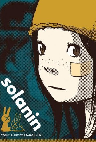
solanin.jpgJust gotta take a second to disagree with Jog on his review (link) of the new Viz release solanin, by Isio Asano. It’s a well-written review, but it comes to conclusions between 90 and 180 degrees from my own. Admittedly, your patience for stories about young people that don’t know what they want to do with their lives is ultimately the deciding factor in whether or not you might enjoy this one. But… yeah, I loved it. solanin is like Scott Pilgrim but without the video game realism, and twice as much of the drama.

I spent a few hours reading it and enjoyed the reading experience… It sort of lilts along, inviting you to spend time with its myriad of characters and get to know them. In fact, you spend a lot of time in their heads, and again, if you’re alright with people with problems, or if you particularly relate to being 23 or 24 and a bit aimless, it’s a pleasant place to hang out. That sense of security with the characters pays off as well, about half way through the book in a big way, making for a genuninely jarring, surprising turn. Speaking of, solanin enough hooks and twists to keep you flipping the pages right to the end. The art is really lovely too, with a solid and subtle range of expression and body language from all of the characters, and a pleasing and attractive surface sheen. Where Jog was disappointed because he’d read scanlations of later, more accomplished work from Asano and found this one lacking in comparisson, this is my first exposure to his work and I found it ambitious and largely successful.

But, the little stuff like attributing narration appearing on solid black panels to a need to crank out pages every week versus, I dunno, artistic license, I don’t buy it. Jog argues his position well, sets up a strong thesis at the outset of his review and hammers it all home at the end, but in the end I just came to a completely different conclusion. It’s a really solid graphic novel, that I think will particularly speak its target audience of 18-34 year olds… I certainly dig it.

– Christopher

Update: David Welsh weighs in with a review of solanin (link) at The Comics Reporter, and he talks about a bunch of the stuff I liked. Go read.

Tuesday Review: Moresukine

Urgh: So, I forgot when I started writing this review that I said I’d only recommend stuff that would actually be in stores for you to buy… And I think this is still a couple of weeks away. So, uh, sorry. I’ll probably re-run this review when the book comes out. Hope you don’t mind? I’ll try and come up with a little something that you actually CAN pick up in stores this Wednesday.

moresukine_cover.jpgMoresukine
By Dirk Schwieger
$15.95, 176 pages (with foldout), Paperback
ISBN: 978-1-56163-537-5
Published by NBM Publishing

Reviewed by Christopher Butcher

I was lucky enough to grab an advance-advance copy of Dirk Schwieger’s Moresukine at this summer’s Comic Con International in San Diego, direct from the artist himself. I paid full price, and it’s the only book I got signed while I was there. That should tell you that I liked it. Even though I was already a fan of the work from its serialization online in 2006, I have to admit a little bit of disappointment at the print edition, which saw many of the pages suffer unfortunate cropping and printing problems. Many of the densely-packed pages of art and text were bleeding right off the edges of the page, more-or-less legible but incredibly distracting. But it’s with great joy that I can announce that the review copy that arrived today is free of those problems, which may account for the book’s exceptional lateness (it was originally due in July). It looks like NBM might have gone back to press on this title, to provide a better edition. If so? Bravo for them, for their commitment to quality! And… maybe sometimes it’s better not to get one of the first copies off of the press.

Moresukine is how you pronounce “Moleskin,” as in the notebook, in a Japanese accent. The book is named after the diary that German-in-Japan Dirk Schwieger used to chronicle his adventures in the city of Tokyo, comics-style. But he took the casual observation of his temporary home a step further, offering his comics’ online readers a chance to shape the comic and his coverage in the most direct way possible: tell him what to do, and he will do it, and draw a comic about it. And people did just that from January to June 2006, each week with a new installment and a glimpse into life in Tokyo. We get to see first hand almost as it happened what Harajuku fashion is really like, the terrifying truth about Japanese toilets, and discover the deadly fugu fish in a way heretofore only afforded by The Simpsons.

It’s funny, when I first start to tell people how much I enjoy this strip and this new collection, they do a little politically correct-minded wince at the strip’s title, worried that it might be drawing humour from an uncomfortable place. I understand those concerns, but I can’t really see anything in Schwieger’s stories that are mocking or denigrating Japanese culture; Dirk takes great pains to engage Japanese culture on its merits, whether serene or seemy, and to present his experiences as honestly as possible. It’s really not until the end of the book when the reader is exposed to more… uncomfortable attitudes towards “foreigners” (and let’s not forget: Dirk is the ‘foreigner’ in this book) that you realize the careful way in which Schwieger has presented his experiences in this culture. More on that a little later, though.

moresukine_origami.jpg

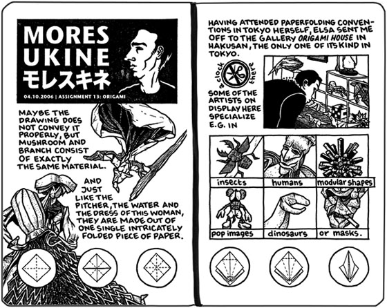
At first flip Moresukine is a bit of a mixed bag…Schwieger’s thick line impressively diagrams the food and architecture that make Japan so alluring, but it seems uneasy and occasionally awkward depicting the human form. Each entry (“assignment”) starts off with a singularly unflattering and perhaps even ugly profile portrait of Schwieger, and considering that both North America and Japan love their clean, attractive human forms when it comes to comics, I can see how it might turn off potential readers. The ugliness of those portraits belies how accomplished Schwieger’s cartooning really is, as Schwieger is called upon to chronicle a startling array of objects, and situations. He displays a high level of craft in his depictions of the intricate folds of origami, or in the heavily-rendered and detailed (and photo-referenced) can of coffee that sits at the center of one assignment. His depictions of his human characters tighten up noticeably when working from photos, and his drawings of a friend taking him to his first okonomiyaki restaurant, or of the trance-music pioneers Sam & Valley are miles away from his cartoonish self-portraits thanks to the photography. In fact, it’s in Schwieger’s illustration of popular Japanese slang that you get a peek at where I feel his true passion may lie; expressions like “Working with your ass on fire” or “All of America wept” are illustrated in a broad, cartoony style more at home in satire rather than reportage. A few stories in, though, and I feel that these competing styles coalesce into a whole. It’s a bit like Tintin or other clear-line art styles, with intense and detailed backgrounds and objects and cartoonish characters laid over top… give it a few stories and you’ll grow to love it.

moresukine_capsulehotel.jpg

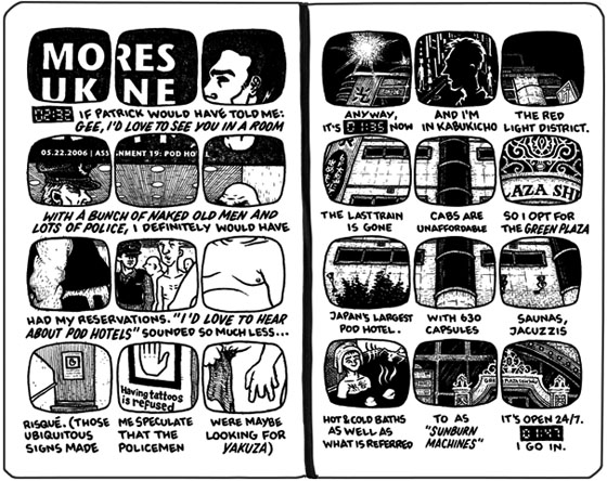
Schwieger’s a real formalist too, which serves the reportage aspects of the stories well. In one assignment he spends the night in an infamous Capsule Hotel, a cramped outing for the 6’4” Schwieger told through a similarly cramped 12-panel grid, each panel in the shape of the coffin-like capsule rooms. In another assignment he attempts to diagram the relationships of gender and sexuality in modern Japan, and the book folds open and out: A 4-page map trying to connect masculinity and femininity and male and female genders in a series of overlapping, crossing, and messy lines; as fluid, confusing, and wonderful as the real thing. His depiction of the lofty bliss of eating great sushi is matched side-by-side, panel-for-panel with the creeping horror of ingesting natto, and is particularly effective. Schwieger’s narrative experimentation gets the better of him a couple of times: A tier of panels randomly reading from right to left to fit design rather than function is distracting, the cacophony of imparted cultural knowledge occasionally overwhelming the reader, but these are minor complaints. Ultimately, Schwieger takes great pains to match the interest of the experiences with a similarly interesting visual narrative; another success.

Of course, I’m coming at all of this from the point-of-view of being an avowed Japanophile, and it’s small wonder I feel that the experiences of a Westerner discovering Japan are fascinating…Schwieger’s experience inspired parts of my own trip to Japan last year. But you’d have to be pretty hard-hearted not to share in the humour and joy of discovery that Moresukine offers… particularly if you got that Simpsons reference that I made up top. Moresukine is a prism, refracting equal parts fuzzy pop-culture impressions and learned Japanese cultural knowledge into a first-person man-on-the-street travelogue that anyone could enjoy.

A last note to those groaning at the thought of adding another book to their already-stuffed shelves when the content is available freely online; the print edition of Moresukine features Dirk Schwieger making a challenge to his fellow cartoonists, to discover the Japanese culture around them: “Meet a Japanese person in the city you are living in and have a conversation with him or her. Document whatever you deem noteworthy.” A range of poplar webcomics answer his call, and 10 comics responses from Dinosaur Comics, Pokey The Penguin, and American Elf amongst others are reprinted in this book. It makes for a fascinating corollary to Schwieger’s experiments, particularly an extended and “un-politically correct” story from Monsieur Le Chien that makes you realize just how far afield Schwieger’s own presentation of Japanese life could have gone.

– Christopher

The Tuesday Review: Black Jack Volume 1

book_blackjack01.jpgBlack Jack Volume 1
By Osamu Tezuka
$16.95, 288 pages, Paperback
ISBN: 978-1934287-27-9
Published by Vertical Inc.

Reviewed by Christopher Butcher
When I was younger, I wrote diatribes about how Japan’s comic industry was something to be aspired to. Among my arguments was the assertion that in Japan, there were comics about everything, and for everyone. Comics for boys, girls, teens of both genders, young men and young women, salarymen and housewives, even the elderly! And the genres too… we had never seen anything like “business man comics” in North America, Dagwood Bumstead was about as close as we got. Hell, they even had a whole genre of comics about risky surgery, that’s something! So now, many (many) years later, I hold in my hand Black Jack Volume 1, likely the originator of the brilliant surgeon comics genre (echoed today in series’ like the thriller Monster). I’m pleased to report that my teenage ranting was not for naught, that I understand how a whole genre, hell an industry could spring up around the enigmatic titular character.

Originally serialized from 1973-1983, Black Jack is from the same period of work that saw Vertical’s other more mature Tezuka releases including MW, Apollo’s Song, and Ode to Kirihito, although this one was serialized in Shukan Shonen Champion, a popular manga magazine amongst boys and teens. It remains some of the maturity and reality of the gekiga-influenced mature graphic novels by having the characters interact with the social and medical ills of the day, though it isn’t afraid to take a younger and more crowd-pleasing tone. In fact the first story in this volume features some of the most extreme super-deformed expressions I’ve ever seen from Tezuka, which sets a strange tone in a story that’s ostensibly about grisly injuries and sicknesses, and the smorgasboard of humanity that Black Jack’s operating table becomes. Further, fantasy and outright science fiction drop in when the stories call for it, with psychic communication and a self-aware computer driving the action in some of the more memorable stories. Black Jack has all of the commentary on the human condition of someone like Tatsumi’s work, but with all of the grit sucked out and replaced with a shonen adventure comic; it’s timely, it’s affecting, it’s got bizarre stories to keep everyone entertained, and no one has to fish an infant corpse out of a sewer.

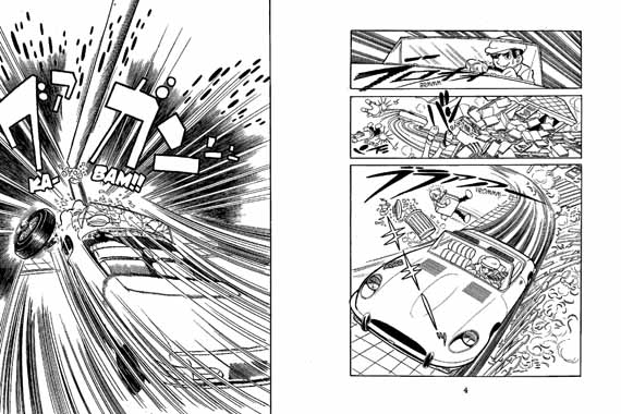
The storytelling is interesting, as it comes from one of the most celebrated and accomplished points in Tezuka’s career…Tezuka’s attention to detail in the surgery scenes is thrilling, and the few action sequences (in particular the one beginning on page 124) are almost elegant in their telling. Tezuka also composes a page beautifully, and although the book is printed in its native right-to-left format, Tezuka’s storytelling is marvelous at moving the eye across the page. Check out the first two pages of the book here, presented right-to-left:

blackjack1_page_02.jpg

Although this collection is based on what would be considered the Japanese “perfect collection,” much like the Dark Horse release of Astro Boy the stories here don’t appear in the order that they were originally serialized, and so the art does move back and for a little. Some faces and expressions are more confident, some of the storytelling is smoother, the stories vary wildly in tone, and most telling, a sidekick character and domestic situation are introduced for Black Jack very early on, which intermittently disappears from the stories that follow… It looks like in this collection, Black Jack’s annoying-but-fan-favourite sidekick is introduced much earlier than the original serialization, and then they go about pretending she’s just off-panel for some of the stories that clearly took place before that event. In fact, further complicating viewing this as a historical work is the fact that it really is based on a “Perfect Collection,” and as my own visit to the Tezuka Museum in Japan revealed Tezuka would often extensively re-draw characters, scenes, and whole stories for new editions of his works, and that’s clearly present here.

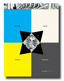
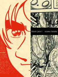
blackjack.jpgBlack Jack doesn’t really work as a historical record, or a reflection of the time in which it was created because of the re-drawing and re-sequencing, and I think that the earlier Vertical Tezuka releases are where you would want to go for that… But considering Vertical’s ultra-contemporary book design choices and packaging, it seems that they aren’t interested in presenting Black Jack as a historical document anyway. The bold graphic design on this book is almost non-representational, a small piece of Tezuka’s art depicting the inside of a body is obscured and cropped so as to appear nearly abstract; the back cover features a sprawling futuristic industrial complex built from Lego. This is not being presented as a record of manga’s glorious past, but as a vital and engaging contemporary work. It reminds me of Viz’s handling of their recent release Cat-Eyed Boy, actually, in eschewing a historical connection almost entirely. To that end, volume one of Black Jack is entirely devoid of any sort of historical or academic context… the stories run right to the very last page of the book, endpapers be damned. I understand this decision of course, but I ultimately disagree with it: the stories don’t work presented as contemporary entertainment. They’re simply a little too unsophisticated for a generation of readers who are familiar with shows like ‘House.’ The formula is exactly, exactly the same of course, with the mysterious taciturn brusque brilliant surgeon solving the rare medical condition of the week, but the lengths to which Black Jack’s surgical prowess are stretched could snap a suspension-bridge of disbelief… But they’re totally fun, totally engrossing. Black Jack is a page-turner of the highest order, and I blew through 280+ pages and I’m hungry for more. I just feel that, seeing as this is the 20th-or-so Tezuka graphic novel I’ve read, I’m one of the initiated, I’m on board. As such, I’m the kind of reader that wants to know as much about this character and this world as possible, and I want a killer piece of Tezuka art on the cover too!

Of course, everything I’m asking for might actually be present in the limited-edition hardcover version of Black Jack, arriving in comic stores everywhere tomorrow (September 24th). That one actually has a picture of Black Jack on the cover, and an extra story that was excised from the Japanese perfect collection (perhaps it was too silly even for them!). I’ll be buying that one tomorrow, and every volume thereafter, because despite whatever conceptual problems I have with how the work is presented, the work itself is still great, still enjoyable, and a record of one of the most popular and beloved comics and characters of all time. Who could pass that up?

– Christopher

Black Jack artwork © 2008 by Tezuka Productions.

Images from top: Black Jack soft cover Volume 1 cover, Black Jack Volume 1 pages 6-7 excerpt, Black Jack hard cover Volume 1 cover.

Review based on a complimentary copy provided by the publisher. For more on Black Jack including two full stories to read, check out the Vertical website at http://vertical-inc.com/blackjack/index.html.

The Tuesday Review: DISAPPEARANCE DIARY, by Hideo Azuma

Welcome to the inaugural installment of the Tuesday Review. My new review column will feature a work that will be in stores the next day (Wednesday, new comics day) or a work that has been out for a few weeks and should already be in stores everywhere. Of course, owing to my somewhat esoteric tastes not every store is going to have every book I recommend, but maybe that’ll convince you, my readers, to badger your store into carrying good, challenging, and interesting material that’s just a bit off of the beaten path? It’s worth a shot anyway… With that, here’s a book that arrived in comic book stores everywhere about a month back. Enjoy!

Disappearance Diary
By Hideo Azuma
$22.99, 200 pages, Paperback
ISBN: 978-84-96427-42-6
Diamond: JUN083951H
Published by Fanfare/Ponent-Mon

I think it’s worth noting, first off, that this is a comedy about a man who chooses to be homeless, suffers numerous breakdowns, and then spirals into alcoholism. A comedy. I think it’s important to take all of that into consideration when deciding whether or not this is the book for you.

Me, as soon as I heard about it I couldn’t wait to pick it up!

Disappearance Diary is a rare thing in English language manga–direct insight into the collective mind of the Japanese Manga Industry by an accomplished creator who worked within it for decades. Author Hideo Azuma created numerous manga serials for various magazines over the course of his career, more than a dozen are named in the book itself, and is credited with the creation of the “Lolicon” genre of manga (cute, sexy young girls in sexual situations) that would later give way to the concept of “moe” (moh-ay) or superlative cuteness. Basically, this guy has serious manga chops. The thing is, it nearly killed him to acquire them.

The table of contents for Disappearance Diary breaks the graphic novel down into four components: “Walking At Night,” covering Azuma’s first escape into homelessness, “Walking Around Town,” in which Azuma again escapes the glamourous world of manga creation to work anonymously for the gas company, “Alcoholic Ward,” which details Azuma’s battle with alcoholism, and “End of Book Discussion Hideo Azuma & Tori Miki,” which is an interview between Azuma and manga-ka Tori Miki, a contemporary of Azuma’s who has had one great book published in English by Fantagraphics: “Anywhere But Here.” But to my mind the two most important sections of the book aren’t listed on that table of contents: one is tacked onto the end of the second section, and the other is literally hidden from sight–and they are quite simply the strongest sections of the manga.

But lets back up a little bit. The quote on the back cover of Disappearance Diary is pulled from the second panel of the book, and it reads “This manga has a positive outlook on life, and so it has been made with as much realism removed as possible.” It’s a little unsettling to pick up an ostensibly non-fiction, autobiographical book and see that on the back cover, and as the first sentence. I was a little surprised myself, and I imagine that it might put off those without a sense of humour about this sort of thing (anyone who tried to return a copy of James Frey’s Million Little Pieces, for example). But when the author’s first suicide attempt arrives 2 pages later and it’s hilarious rather than tragic, you begin to understand–and be grateful for–his light-hearted approach to personal tragedy. It’s impossible to tell how much of the thought and action attributed by Azuma to his adorable cartoon stand-in is strictly true, strictly accurate, but almost regardless it’s certainly convincing. By the second or third short story I was rooting for Azuma–to find some food in the wilderness, to figure out how to keep the rain off of him, and avoid being discovered by the authorities. It’s a hell of a thing to root for a guy that has abandoned his life, his wife, and his infant son, but such trivial and earthly concerns nearly-evaporate when Azuma figures out how to build a fire… It’s all a bit like if Tom Hanks’ character crashed the plane himself in ‘Castaway,’ but you’re still excited when he cooks the crab! The Azuma stand-in is incredibly self-effacing, humble, and especially adorable. He is designed to be loved, a personification of the lolicon/moe/kawaii ethos that Azuma the author contributed to developing within the manga industry. Azuma needs your good will and your empathy though, because that’s what makes his spiral into truly self-destructive behaviour so affecting, and enraging. By the time he gets around to explaining just why exactly his life was so tough, you can’t help but feel for the poor cartoon guy, and that wouldn’t have happened (I feel) with a more realistic depiction of Azuma, or his actions.

So at the end of the second section, “Walking Around Town,” it looks like Azuma simply ran out of stories to tell about his second foray into homelessness and obscurity, and so to fill out his serialization he decides to tack on three short pieces that chronicle his entire career in manga up until he checks into rehab, the last major event in his life before he begins creating this book. This might be the most important, and difficult to read, section in the manga, as it describes in painful (though surprisingly light-hearted) detail just how intense the creation of our favourite manga can be. It’s one thing to be told “Working in the manga industry is tough!” It’s another altogether to work alongside our beloved and cherubic narrator and see him slide cheerfully into oblivion. Rereading Disappearance Diary for this review, I couldn’t help but compare Azuma’s horror stories of working in the manga industry to the recently unearthed documents surrounding Siegel & Shuster’s dealings with National Periodicals during the early days of Superman. Is there something endemic of comics that creates creators that drive themselves to ruin and editors there to backseat drive the whole way? Azuma puts forward a solid argument for.

Another key piece of these stories, presented as almost an afterthought in the book, is that we’re introduced to them via a conversation between Azuma and the editor of the book we’re reading, probably in serialization. Azuma never lets you forget that you’re reading a manga about his problems with manga, making you complicit in the acts that cause his downward spiral. Of course he never accuses the reader directly, and takes great pains to filter these experiences through a very deliberate prism separating the heartbreak out and leaving only sunshine and humour behind. He lays out all of the clues for you and lets you make your own mind. Actually, he does that in his portreyal of his editors at the time as well. By all accounts, these men drove him not only to drink but to the drink of death, but he treats all of them with the lightest possible touch. They come off as heartless, uncaring, maybe even a little evil at points, but Azuma simply presents things as they were (to his recollection) and again, lets the readers fill in the gaps. Why? Well, I think it’s telling that his harshest criticisms of his editors are, effectively, “They stopped giving me work!” Despite all of the hardships and heartache, you get the feeling that he wasn’t entirely ready to burn his bridges with these folks, just in case he might get an assignment or two out of them again…!

The third section of the book chronicles Azuma’s fall into alcoholism, and his slow recovery in a rehab clinic, and that’s by turns funny and horrifying and as enjoyable as the rest of the book. Seriously, by this point in the book I was completely in love with it, all of its promises fulfilled. Well… almost all of them. The book ends with Azuma clearly on the road to recovery, managing his alcoholism but… still clearly in rehab. I mean, we’ve already seen him post rehab at the end of the second section of the book, we see that he comes out of it, but the book is left on a cliffhanger, with Azuma promising to tell the rest of his story “next time…”. That leaves us with the end-of-book interview to fill in the gap, to offer clarity and context to the graphic novel. But of course, that wouldn’t be in keeping with a positive outlook on life, with as much realism removed as possible, now would it? Which isn’t to say that the interview with Tori Miki is devoid of content or closure… It’s just not what we want after spending many years and 200 pages with Azuma. We want the last word on him, or a breathrough, or something, and in the end what we get is his life, as honestly as he could bare to tell it (and full of as many jokes as he could cram in). And he answers one of my early questions too–Azuma says that not everything that happened made it into the book, but everything that’s in the book actually happened.

The real clarity comes in an interview that is hidden from the reader… I’ll let you discover it for yourself but I will reveal that this hidden interview is where Azuma offers the first real bit of insight into his actions, what it means to leave your life behind. It isn’t pretty, but it lasts for only a moment or two before disolving into a conversation about which popular Japanese idols are prettiest. Azuma is certainly committed to his manga ideology, I’ll give him that.

I guess I’ll finish off by saying that, in today’s graphic novel market memoir and autobiography are the genres that have found the most traction amongst real mainstream readers… at least the ones not buying movie tie-ins. In a just world, this one would find a great deal of success… But I have a feeling that Disappearance Diary has traded in too much of what mainstream audiences want from their memoir for a gentle, knowing humour and a refusal to find a conclusion in an ongoing life. Disappearance Diary is a book that can find the comedy in tradgedy, and as we’ve already established that’s the book for me!

A copy of this book was provided for review by the publisher. But let’s be honest, I woulda bought in anyway…!
– Christopher

Review: Project Superpowers #0-#3, FCBD Special

superpowers-ross-painting.jpg

Project Superpowers #0-#3
By Alex Ross, Jim Krueger, Doug Kaluba, Stephen Sadowski, Carlos Paul, Andy Smith, and Various
#0: $1.00, #1-3: $2.99 each, FCBD: Free
Published by Dynamite Entertainment

Two series’ launched recently with very, very similar premises: Forgotten heroes from the Golden Age of comics, roughly World War II, are taken out of commission for 60-odd years, re-emerging into the present day with times having radically changed around them. One of those series, The Twelve by J. Michael Straczynski and Chris Weston and published by Marvel Comics, has been surprisingly good. I look forward to each issue and the progress that these forgotten heroes are making in the post-Civil War Marvel Universe, and no one is more surprised about that than I. But with a full 30 days between installments of The Twelve I figured I’d give the other series a go, see if I could find something to fill my “old-timey-men out of place and out of time, with seeeeeeeeeeecrets” jones.

So, that was pretty much a mistake. Despite very, very similar starting points, the two series could not be more different than one another. Whereas The Twelve is a gritty and intriguing mystery/drama slowly being revealed to the reader, Project Superpowers is a pretty straight-forward superhero beat’em-up by Alex Ross and Jim Krueger, the creative team behind Earth X. Actually, if you’ve read the Alex Ross vehicles Earth X and especially Kingdom Come, you’ll be on incredibly familiar ground here as all of the standard Alex Ross tropes are here: Repentant old-man narrator, guide from the spirit world, classic heroes appalled by the sorry state of the modern world and its heroes, and more iconic characters standing around posing than you can shake a stick at… Which isn’t to say that Project Superpowers is particularly bad either as a comic or as an example of the contemporary superhero genre, it’s just not what I was looking for.

So on its own merits then, how does the series hold up? I’m not as ‘into’ the big superhero mythology stories as most, but I still found enough to enjoy in the series to keep reading through. The series itself isn’t drawn or painted by Ross, but instead by a fella named Carlos Paul, who has a cartoonish vibe to his pencils, sort of half-way between one of the contemporary anatomist pencilers like Steve Sadowski or Doug Braithwaite, and someone like Norm Breyfogle. The art is always at least functional, with the characters clearly blocked out and the story easy to read, and occasionally there’ll be a nice level of polish on the illustrations as well. Granted, it’s still got a bit of that garish contemporary superhero colouring to it–something that Ross seems to have largely eschewed in his own work lately–but it’s got more of a painterly vibe than most contemporary comics work which created a great deal more visual interest than most books on the rack. It’s still going to be a bit of a shock-to-the-system for readers picking up an “Alex Ross Book” and getting not Alex Ross art inside, but the work is much more Brent (Astro City) Anderson than contemporary-meh-DC-penciler, which will soften the blow.

As for the story? I’ll be honest, it’s a step above most contemporary superhero comics, but that’s quite clearly me damning this with faint praise. Alex Ross is a poor writer, and I’m not quite sure what Jim Krueger’s contributions have been, but I really remember liking some of his earlier work… The biggest problem Project Superpowers faces is that ‘clarity’ seems to be a four-letter-word, with the writers mistaking confusion for drama. There are lots of short scenes dropped in without explanation, lots of cuts back and forth in space (and occasionally time), blind prophet characters shouting about the end of days, ghosts shouting about spectral duty, superheroes just shouting at one another, and so far it’s added up to not-very-much. The narrative through, the story of a golden age hero named “The Fighting Yank” hoping to atone for past sins, is easily the best part of the book, and the scenes moving that story forward have been enjoyable. The rest of it, with random heroes getting little introduction alternately screaming or “being mysterious”? I could do without that. I feel like Ross and Krueger are relying a little too heavily on their past writing styles here… It’s one thing to have The Spectre, Captain Marvel, or any number of popular iconic characters shouting at one another or uttering mysterious nonsense that might eventually pay off in the story; the reader is already invested in those characters thanks to years and years of familiarity–it’s the very definition of a fanboy-oriented event comic. But when the reader has no idea who any of these characters are? When you haven’t sufficiently invested them with any humanity (other than: blanket tragedy, ‘mystery’, and screaming) it’s really hard to give a shit and I don’t. By contrast, The Twelve has done a great job of the ‘slow reveal’, with plenty of characters populating the book that you want to spend time with or, if not, at least want to figure out how their stories will end. But there I go comparing Project Superpowers to something else again. I guess what I mean to say is, in Project Superpowers I’m curious to see where the plot is going but so far I don’t care if anyone introduced in the series makes it to the last page, you know? And since the whole vibe of the book seems to be about re-introducing these golden age characters to the modern world (and aren’t they all nifty!?) that’s kinda-sorta a problem. I guess when you’re Alex Ross you don’t need an editor to point out huge flaws in your storytelling…which would explain why no editor is listed in the credits page. Guys: give these new characters you’re introducing something to do, or leave them out of the story until you figure out what they’re for.

So, to sum up: I’ll probably wait another few issues and then catch up with the story again. Anyone who’s liked Ross’s last few outings in big bold superheroes will probably really enjoy this one and should check out that $1 issue #0 (28 pages for a buck!) at the very least: It’s a big, bold superhero story that is very close to all of the work you already love.

But The Twelve will be one of those books that I read first thing in the morning, standing at the rack on the day of release, wondering if Dynamic Man and Captain Wonder are gonna hook up.

– Christopher
P.S.: Skip the FCBD story, it’s poorly drawn and nothing happens in it, and it jumps past the end of the current story arc, which is vaguely stupid when you’re trying to write a mystery…

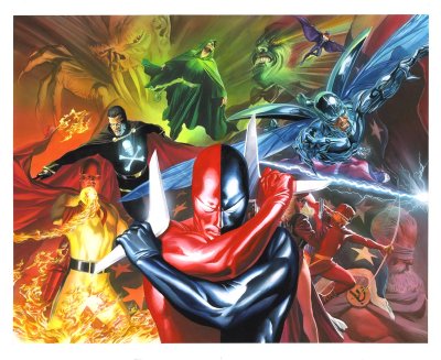
Image: Cover painting used for Project Superpowers #0a and #0b, by Alex Ross.

PiQ Issue #1: Post-Mortem

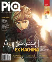
piq-cover-small.jpgI think it’s important to point out that in the first issue of PiQ, the magazine calls its readership the following names: nerds, dorks, geeks, freaks, maniacs, and pervos.

They seem to mean these little bon mots with affection, but it does tell you quite clearly what the editorial staff thinks of its readership. Of course, the new magazine from ADV (nascent anime and manga publisher) is meant to replace Newtype USA, their former chronicle of otaku culture with a name and content licensed from the original Japanese Newtype magazine, and so some recognition that it is the hardcore fan who may be used to such derisive terms may simply be a way to ingratiate itself to the new readership. But it’s going to take a lot more than saying that we’re all nerds together and adopting the tagline “Entertainment for the rest of us” to convince me that they have anything to say, let alone that we’re all alike…

I previously covered PiQ magazine when I got my hands on the press-kit for the magazine prior to its release. The press kit broke down the aims of the magazine and their demographics quite clearly: they want men age 18-34. I’d say the magazine delivers on that promise, though they don’t quite realize that not every man in that demographic is interchangable…
I’m going to be upfront and say that I disliked the first issue. I’m not going to string you along listing good and bad before revealing my ultimate conclusion; PiQ Magazine #1 wasn’t very good. That out of the way, PiQ does have strengths to recommend it, and a lot of potential, but going by the first issue they’re going to have to work awfully hard to achieve any measure of success. It’s incredibly problematic and likely quite rushed, and with a lot of former Newtype readers already very, very angry at them, they’re going to need to improve, and quickly, to get a chance at long-term survival.

I’ve written an incredibly thorough page-by-page analysis of the magazine. It’s taken days to actually put it all together. I’ve included it behind the cut because people browsing here probably have no interest in a 6500 word essay on a magazine that they will never read, but when I say POST MORTEM I actually mean it. I am digging through the entrails of this thing CSI-style to find out what they’re doing and why. Don’t say I didn’t warn you, and you probably shouldn’t bother reading unless you’re really, really interested in the subject.

With that, click to continue: Continue reading “PiQ Issue #1: Post-Mortem”

Review: Tokyo Is My Garden

cover_lit.jpgTokyo Is My Garden
By Benoit Peeters and Frederik Boilet, with Jiro Taniguchi
$18.99, 152 pages
Published by Fanfare/Ponent Mon
http://www.ponentmon.com/new_pages/english/princ.html

Brigid at Mangablog called me out regarding my appreciation for Tokyo Is My Garden, a 2007 release by Fanfare Ponent-Mon and, like most of their releases, doomed to obscurity for some reason. Well I didn’t take her up on her challenge due to my blogging time being cut short as of late, so she just kicked me in the butt and posted her own, very balanced, review of Tokyo Is My Garden. I have a little bit of time on my hands while at work (hurrah for dinner-breaks) so I figured I’d link to Brigid, but also talk a little bit about why I enjoyed the book so much.

First though, I want to complain about Iron Chef America, on The Food Network.

Despite loving show host Alton Brown and being happy to see fellow Canuck Kevin Brauch on the screen, I find the whole thing to be so much lesser than its Japanese counterpart and originator. It’s considerably more crass, with less of a sense of humour or pagentry, making up for it with bitchy reality TV nonsense. The worst part though, the part that just grates on me when I watch it, are the judges and their inability to be anything but literal and low-minded when it comes to their duties. The role of the judges is to determine how well the chefs articulate the theme ingredient in their dishes, but the most common and common complaint of the judges is that “I can’t taste the theme ingredient!” If it’s bacon then the dish isn’t bacony enough; fish isn’t fishy enough; leeks are “overpowered” by the other flavours. Admittedly some judges are worse about this than others, but for the most part, the judges seem to believe that the only way to articulate an ingredient is by having the dish scream out that flavour above all others.

Where’s the subtlety? What about articulating the theme ingredient through… I dunno, the texture, like the real Iron Chefs do (wherefore art though, Kenichi-sama?). Or in the subtle melding of flavours? Or just for colour? Is the only facet of cuisine the purest and brightest essence of what its cheif ingredient? Or is food subtle, layered, and surprising? The answer is the latter of course, because if it weren’t, than the Jones Soda Turkey-flavoured holiday soda would be available all year round! Everyone likes turkey, why wouldn’t they want it concentrated in carbonated form, right? Because there are other facets to eating, and to enjoying a meal obviously. But try telling that to an Iron Chef America judge. Dicks.

Right! So, why did I enjoy Tokyo Is My Garden so much? For its sweetness, its sense of place articulated by its lovely art. Because it is a story of young love where the challenges the lovers face are internal. Early on in the book, the characters talk about “sad French novels” and the book is quite conscious of being a sad French graphic novel throughout, brilliantly turning those expectations on their head through a number of plot contrivances that evoke the classic romantic comedies of the 1940s through the 1960s. A happy ending and the sort of gentle redemption that comes from the various characters’ gentle transgressions. It reminds me a lot of the work of Dupuy & Berberian actually, a sort of upper-middle class existence in a fabulous city, where the characters tribulations are largely due to their personality quirks and their fears and inadequacies. It’s a fantastic change of pace from the melodrama of most manga (let alone most commercial graphic novels). A smart, funny, romantic romantic comedy.

But, the plot! There isn’t enough plot! I understand Brigid’s criticisms, that the plot is ‘thin’ but I don’t agree (obviously). Rather, the plot is thick enough. The plot doesn’t need to scream at you, in my opinion, for a book to work. What is the best way to articulate the themes and aims of your story? Sometimes it isn’t a bold, bright, forthright “flavour,” but rather subtlety. Sometimes it is the texture of the relationships, simple clues about how people interact (the lead and his French boss, the lead and his girlfriend, the boss and the rest of Japan) that generates the friction that drives the story forward. The colour! The interplay! Were this story a contemporary manga (rather than nouvelle manga, as the author calls it) I feel that it would be told quite differently, the stakes much higher and the action more intense! If it were published in North America I feel it might read exactly like one of those terrible 100 page “film treatments masquerading as a graphic novel”. If it were a film made today, I feel like it might end up exactly like the sort of uninspired tripe that A.O. Scott talks about in his review for this weekend’s “Fool’s Gold.” (Thanks to David for the link). Instead, we have a delightful hybrid French/Japanese graphic novel that, when I put it down, I feel great about having read. A book that I made my husband read and he similarly enjoyed. A book that I wouldn’t hesitate to recommend to you. That’s not to say that I don’t understand why it felt a bit flat for some reviewers, I do, but I think it comes down to the expectations of story that you bring with you to the table. It may be why Dupuy & Berberian’s Get A Life and Maybe Later didn’t set the blogosphere on fire either…

I think that if I’d never seen Iron Chef in its original Japanese incarnation, I’d be far more charitable to its American sequel. But I know that there’s a show out there that is just more enjoyable, where the judges have a greater and more nuanced appreciation of food, and it makes it hard to watch Mo Fucking Rocca blather on and on about nothing, only present to resuscitate his own failing career. Likewise, I think I appreciate the light touch of Tokyo Is My Garden, the gentle appreciation of a beautiful city, a beautiful young romance, and the cultural differences that separate and ultimately unite us.

– Christopher

The Best American Comics 2007, and the best comics of 2006

bestamericancomics2007.jpgThough the official release date isn’t until today, The Best American Comics 2007 can already be found on store shelves everywhere, be they ‘comic’, ‘book’, or virtual. In fact, even before this Chris Ware guest-edited volume was available, the vast majority of the works in this volume could be found on the bookshelves of any artcomix fan who was paying attention from August 2005 through August 2006. Even though the raison d’etre of the Best American series of anthologies is to scour the totality of printed material for good works, the 2007 Comics edition is particularly notable for drawing the majority of its material from the output of publisher Fantagraphics books, and in particular their anthology Mome makes a very strong showing. In fact, upon receiving the book a few days back one of my more outspoken retail compatriots remarked (with a good measure of actual anger) that there was nothing for him in this book, since he’d already bought all of the Mome volumes, Kramer’s Ergot, and Charles Burns’ Black Hole. It’s actually that anger, which I’ve heard from more than a few people now, that made me want to review this volume and Mr. Ware’s examples of the best of comics in 2006.

Ware’s introduction to the book is interesting, as he writes about visual literacy and invention in the context of his own work and in the work of the artists he has assembled here. Of course (and in typical self-depreciating fashion) he throws the idea that this is the ‘best’ work in comics right out the window in the first paragraph: No matter how much you criticize Chris Ware, you can be sure that he has already beaten you to the punch in doing so. Instead he talks about the work in terms of “telling the truth,” which he states to be the primary attribute in comics stories that he personally enjoys. This shouldn’t be mistaken for an elevation of non-fiction over fiction or any other such fallacy, but instead Ware seems to best respond to works that seek to understand, explain, and celebrate the human condition, and that’s evident in the book. More than half of the books’ stories are outright biography or autobiography; the only real concession to the fantastic seems to be in Ware’s appreciation of C.F.’s Blond Atchen And The Bumble Boys and Paper Rad’s Kramer’s Ergot; the hypercolour cute-brut works descended from the Fort Thunder collective and, in Ware’s estimation, the work Gary Panter (Panter also included here via an excerpt from his Jimbo In Purgatory). If “Fiction,”as Mr. Ware has posited elsewhere, “allows details and doubts about actual events to be bypassed and the remembered essence of a person to suddenly ‘come alive’ again,” then it seems very much like that fiction oughtta stay as close to plausible as possible, if the choices here are anything to go by.

The collection isn’t a bad one, and seeing as it is produced and marketed for a ‘general public’ graphic novel reader it’s a lot harder to fault it for being picked from a fairly small (though very deep pool). I’d have a hard time arguing against any of the included works as being undeserving of the “Best Comics” tag, and I probably wouldn’t bother either because that kind of behaviour is kinda dickish. But even the briefest page-through of the book will show that while it is a coherent and considered opinion on comics, it also isn’t representative of the North American comics publishing industry as a whole. Luckily Ware has already forestalled such criticism (told ya!) but it’s still a little aggrivating that, for example, anything with a whif of genre about it is seemingly disqualified, despite its ability to get to get at “truth” in it’s own way. Further absent are any comics that don’t mark print as their primary medium. I wonder what kind of view of the industry this presents to the ‘general public’?

Next year (and for the foreseeable future) the Best American Comics collections will feature new, permanent Editors in the tag-team power couple of Jessica Abel and Matt Madden. I feel fairly confident in saying that their vision of the Best Comics will look substantially different from Ware’s, just as my own ideas about the best comics released this year do. Will that make for a better, more coherent or thorough anthology though? Will those opinions be any more or less correct? I quite honestly have no idea, but there’s a much better chance I won’t own previously released versions of 80% of what’s in the book, and that’s pretty exciting to me at least!

So my recommendation? Check out the table of contents for this one over at The Publisher’s Website and see how many of the works–or creators–are new to you. If you haven’t purchased much of this work already I’d strongly recommend you do so through this volume… but maybe keep the other eye open and on the rest of the graphic novel rack too.

Meanwhile, Chris, What Did You Think Were The Best Graphic Novels of 2006?

Well I’m glad you asked. Now that literally every award for graphic novels published in 2006 has been given out, AND they made a book out of it, here’s what I thought were the best comics in 2006. I’m not limiting myself to works by North American creators as Mr. Ware is, but I am requiring English-language publication in 2006. I’ve included my (whopping) 28 choices behind the cut below. Let me know what you think: Continue reading “The Best American Comics 2007, and the best comics of 2006”

THIS WEEK IN COMIC BOOKS

I READ SOME COMIC BOOKS THIS WEEK. HERE IS WHAT I THOUGHT OF THEM.
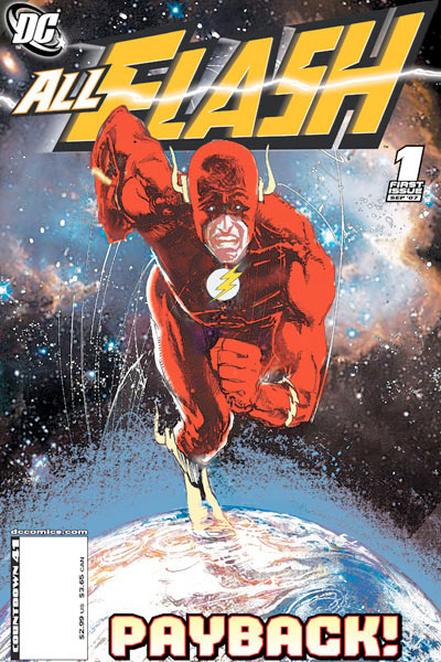
allflash.jpgAll Flash Comics #1: It’s so… awkward… and self-congratulatory. Ick. I want to say “Hey, Karl Kerschl’s art was the best thing about this” but then I’m sorta-friends with Karl and my opinion is suspect. I dunno. I was reading it and it’s exactly not-bad, not-good in the way that many (most?) superhero comics are these days. The multiple art teams, the overliance on history and continuity, the weird torture of the bad guys… None of it stood out as bad or good, it was just “here is a sequence of events that will keep you reading until next month”. Wow. There’s nothing there for people who aren’t long-time, die-hard fans of the character, and even though I’m somewhere in that sphere I was just… I don’t like this at all. And the cover by Seinkewicz is… distressing.

Batman: Harley & Ivy TPB: This collection of three disparate stories featuring Harley Quinn and Poison Ivy is pretty fun stuff, with some nice art through and through. Has anyone ever looked at the subtext… or even the text… of these stories though? Yikes. It’s exactly “Dudes who are attracted to hawt cartoon characters put them into vaguely pervy situations for their own edification,” which is… every single female hero or villain in comics? It’s fun, just don’t read too deeply into… any… of it. Like the women-in-prison-flight ‘homage’ at the beginning of the second chapter of the titular mini-series, where the butch lesbian prison guards get rough with our two hot antiheroines. Actually, that whole last mini-series feels like Paul Dini letting loose after too many years dealing with cartoon censors and Hollywood… It’s interesting, and like I said, fun… if you don’t think too hard about it. Mmmm… probably not for kids.

bigplans1.jpgBig Plans #1: This is a Xeric-grant winning comic that we got in because we more-or-less support every Xeric Comic. It’s a mini-comic though, which is kind of weird, because I’d always assumed that the Xeric thing was to help you do something a little more professional than something that looks like it came off of the Xerox machine. The comics themselves are interesting, each page a six-panel staccato with lots of white-space elevating stories of the mundane into the… what’s less than profound but still pretty interesting? Well-observed, anyway, particularly the terrorism story. If I picked this up at MoCCA for $2, I’d be pretty happy. For it to be solicited through Diamond at $5, I’m less happy. There’s just not enough to it to justify the price tag, and I can’t help thinking that the author’s chosen format won’t really help him get noticed, let alone further develop his career. Maybe I’m wrong, maybe there’s a whole industry for stapled 5.5″x4.25″ comics that I’m unaware of. That are also available at http://www.aronnelssteinke.com/ entirely for free. But yeah, this is one where the format disappointed me much more than I enjoyed the actual content.

Captain America #28: This one felt a bit like a place-holder issue, particularly after the starling revelations and non-stop action of last issue. It’ll read better in the trade. Aside from the bad guys showing you they’re bad by killing a lot of people, and Sharon Carter awkwardly dancing around a few questions… yeah. Brubaker’s setting up the pieces in this issue, which didn’t really grab me the way that the rest of the arc has. Even though it came out a few weeks ago I finally read the newest issue of CRIMINAL, which was similar (setting up the pieces, pulling together the plot, showing what a bad ass you are) and it worked far, far better.

Comics Journal #284: I’ve only skimmed this so far, but man, do I not care about Roger Landridge at all. There’s just nothing there that I find interesting. Anyway, somehow I got sucked into reading Tom Crippen’s piece on the fanboy inside all of us and that was just brutal. Like, massively depressive, mostly because you could insert “There but for the grace of God, go I” after every paragraph. I haven’t seen any online reaction to this column yet–maybe The Journal has stopped being relevant for that sort of thing, I don’t see them stirring up much controversy lately unless it’s fucking with Harlan Ellison–but I’d be curious what anyone else thought. But yeah, I’ve not read much of the rest of it yet. The Gene Yang interview is on my list though.

Don’t Say Anymore Darling: This is a new collection of old short stories from Fumi Yoshinaga, the author of Antique Bakery. It’s mostly yaoi-centric (though there is at least one entirely straight short-story about a marriage that fails due to… well… the crazy, I think) and fans of Yoshinaga’s gentle, humanistic storytelling will probably love this as much as they love everything else she does. Mmm… me included. Granted, I read this while sick in bed with a head-cold so my retention isn’t entirely there, but the stories are all strong little shorts, usually with a nice shock right at the ending to cast the whole thing in a new light just as you end the chapter. I hope the existance of these interesting, sort of random works means that Ms. Yoshinaga is fabulously wealthy and gets to do whatever she wants with manga; I’ll happily keep reading.
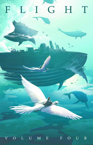
Flight Volume 4Flight Volume 4 GN: Reviewing this is basically impossible since 1/3 of the contributors at any given time are friends of mine, but here goes: Another strong entry in the Flight series. More gorgeous art, more lyrical short stories, definitely worth the cover price. The stand-outs are, once again, Clio Chang (this time with a meta-commentary take on the nature of fables) and Kazu Kibuishi (his story featuring duty and tradition butting heads with desire). It’s a handsomely designed and thoughtfully edited collection, each story sticking around just long enough to be enjoyable, and occasionally leaving you wanting more. I’d have hoped though, 5 years in, to see more of the contributors to the book making more of a name for themselves in the industry outside of the anthology. It still seems like a lot of the breakthrough work is in the pipeline, and as nice as 8-24 pages of work is from many of these creators, I feel like 150 pages of the same is what I really want.

Ghost Rider #13 WWH: I haven’t been “reading” Ghost Rider, so I’m assuming that there’s just someone inexperienced or whatever behind the mantle of the character right now, making the first 2/3 of the book an “inexperienced hero fights Hulk in comedy of errors” routine that was occasionally chuckle-worthy. It all comes down to earth at the end though, when we’re reminded that Iron Man is a bastard, and the Hulk is rightfully seeking Vengence on him, leaving The Ghost Rider to fuck off back out of the crossover. Not bad, I guess? Funny, but hardly essential.

Programme #1: Winner of the “Comic that would most be benefitted by re-reading” award of the week. I think I liked this, all gritty, dirty cold war paranoia mixed with ongoing wars and impotent hulking Americans. I’m not sure though, as scenes rarely last for longer than a page or two, and writer Peter Milligan has had some spectacular misfires as of late. But yeah, despite Jog’s excellent breakdown, I kind of want to figure out what’s going on here for myself, and sadly the cursory reading given to FLASH or GHOST RIDER simply won’t do. At least you’re getting your 3 bucks worth.

Shazam: The Monster Society Of Evil #4: The ham-handed political nature of the story is toned-down just enough to be enjoyable rather than distracting, leading to a fun, over-the-top conclusion. Smith has picked up a few tricks out of contemporary young adult fiction here, making the adults-don’t-believe-kids stuff just annoying enough as to make the kid in me want to jump up-and-down in place going COME ON ALREADY!, which means it’s working. The ending has plenty of heroics, gross moments, a monster-punching or two, and sets the stage for great things to come… which is why what comes next is so depressing. (“Hey kids! That character you just grew to love? HE’S DEAD NOW. Also, his little sister has grown up into a goth cheerleader. Enjoy!”) I’m also wondering about the artificiciality of serialization breaks and their negative effect on the story… but that’s for a bigger discussion down the road.

The Order #1: Sorry Matt. Nothing here grabbed me. And I was actively put-off by the colouring, which couldn’t decide if the lead dude was grey-at-the-temples or not. I’ll read the next issue I guess, but this wasn’t your best stuff and I really, really want Casanova #8 now.

Warren Ellis’ Black Gas 2 #3: I still, honestly, can’t believe that Ellis would let a comic be named after his (presumably) deadly farts. Did no one think about what this would be called? Or maybe they did, and that’s perhaps worse. Ah well. BLEAK! SO FUCKING BLEAK! And, if the gas makes everyone crazy and itching to fuck, how did they all manage to pair off into neat boy/girl pairs? Isn’t that… fortunate? I guess? That the zombies don’t have to have the added stress of having their sexual identities challenged? “Fuck, I just tore the face off that guy but at least I’m shagging the dismembered lower-half of a woman instead of being some faggot zombie!” Ah well. it’s Avatar, you get what you pay for, you just usually get it very late.

World War Hulk #2: Totally enjoyable. Whenever anyone asks me if this is any good (specifically because Avengers Disassembled, House of M, and Civil War weren’t) all I need to say is “Well, Hulk DOES Smash.” I don’t go out of my way to promote this because, quite frankly, I don’t have to. Hulk fucks shit up, which is really all you need from a Hulk comic in the first place and that most stringent of conditions is met? People gladly part with their four dollars. Hulk Smash.

I also ready a bunch of stuff from previous weeks like SILVERFISH (alright), PHONOGRAM (alright I think, not sure about it), and some assorted manga. i guess being sick has it’s up-sides.

– Christopher