On Comment Moderation…

uncle-sam-ranting.jpgI moderate all of my comments.

Primarily because sometimes the spam filter breaks down and I had to delete 50 pieces of Spam from the moderation queue on Friday. Partly because I don’t really value everyone’s opinions equally. Seriously. It’s nice to pay lip service to the idea that everyone’s dissenting opinions are valid and… whatever, but they aren’t. Why am I spending my time and bandwidth giving people I literally think _nothing of_ a platform for their rantings? Why should I expect that I can go to someone else’s blog and say _literally anything_ and deserve to be heard? More importantly, why does anyone want to be a part of a forum where their opinions are given equal weight and access to those of racists, misogynists, misandrists, homophobes, or just the chronically, painfully stupid? Is it masochism?

My blog is not “The Government,” neither is anyone else’s (to my knowledge), no one is censoring you. Start a blog with your ridiculous dissenting opinions. They’re free, and you can spout off all of the hateful stupid bullshit you want. America!
– Chris
A public service announcement, for those that they now need to unsubscribe or otherwise stop reading because my politics disagree with theirs.

CAT-EYED BOY: Bringing the Umezu classic to North America

nekome.jpgOn June 17th, Viz Media will release CAT-EYED BOY, a two-volume collection of the shonen horror classic by Kazuo Umezu weighing in at over a 1000 pages combined (for a bargain-price of about $50 total). This is a pretty radical publishing departure for Viz, and they’re putting a lot of promotional effort behind one of the most unique and important manga-ka in Japan, and one of his most beloved works.

I’m growing ever more interested in the localization and design of manga as it makes its way from Japan to North America. The culture and design of manga in its native country is a pretty unique beast; Japanese graphic design (at least so far as it extends to manga) is very different, generally, to how book design is presented here in the west. So when the fellas over at the Same Hat blog announced that the next Viz Signature manga (read: mature/arty/non-mainstream) would be Kazuo Umezu’s CAT-EYED BOY, I was both excited and curious to see how the work would be presented to North American audiences, and I was lucky enough to score an interview with the folks responsible at VIZ to talk about the ins and outs of the process.

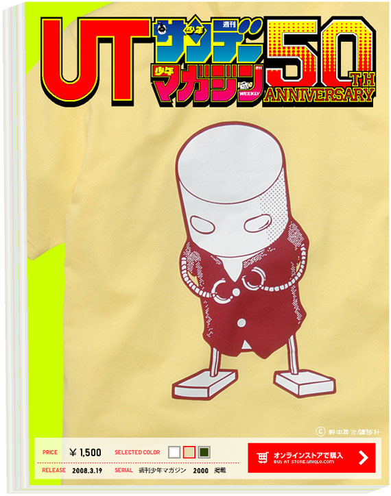
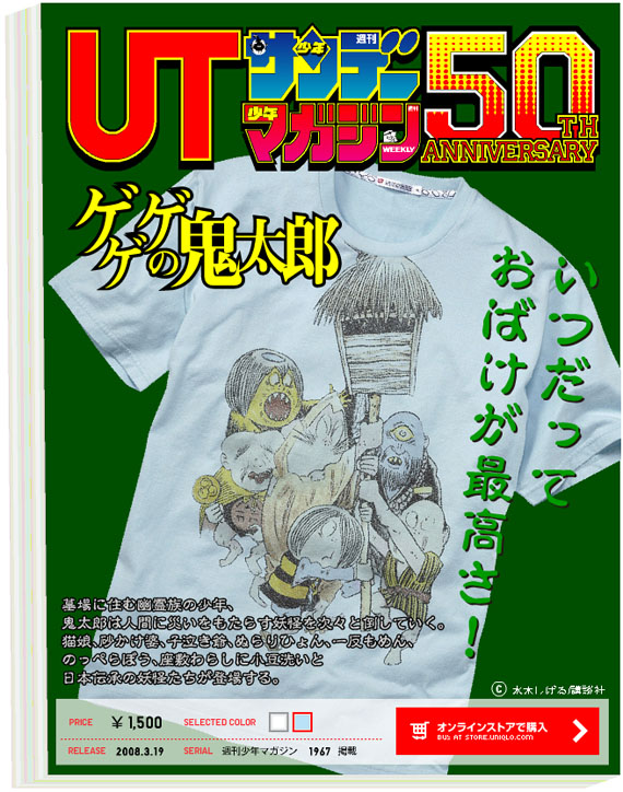
Anecdotally I’ve heard from several manga publishers (and mangaesque publishers) that book buyers favour book covers with big faces on the cover. Covers that prominently feature the lead characters, big images, emphasizing their manga-ness, if possible staring directly at the reader. Contrast this with Japan and Japanese manga design… The covers are frequently dense with text (both on the monthly magazines and the book collections), with a greater range of stylistic choices available to the artist. Frequently in North America, we’ll see manga book covers that feature interior illustrations blown up and re-coloured for the cover, as North American publishers decide (for a variety of reasons) that the Japanese covers just don’t work for this market…

Viz is almost finished releasing another Umezu manga, Drifting Classroom, to much critical acclaim in North America. The story of a an entire elementary school (full of children!) whisked away to a post-apocalyptic wasteland is incredibly compelling; vicious and bleak in its treatment of its young protagonists and wearing a grim opinion of the human condition on its sleeve. Nevertheless, it is amazing, and one of my favourite comics released in 2007. It’s also being released in North America as a “Mature Readers” book, implying a readership of 18+ (but not in an Icarus sort of a way). But when it was originally released in in the early 1970s, this story was intended for readers a lot closer in age to its 10 year-old protagonists (originally running in “Shonen Sunday” Magazine) than to the readership it is finding in North America. So when published in North America, did Drifting Classroom get the “Shonen Jump” treatment, featuring bright bold heroes in full colour grinning at the reader with a GANBATTE! spirit?

drifting_upload.jpg

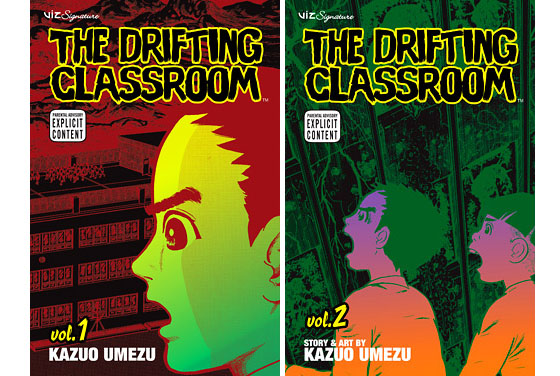
Not exactly, no. Instead, the books are coloured and designed to look as unsettling as possible. Contrasting colours in sickly shades and terrified children are the stars of the show; only the meanest parents would pick this one up alongside Naruto and Shaman King for little Billy. I mean, the life-lessons in Drifting Classroom are probably much more important to any 10 year-old (i.e.: When the shit goes down, your friends are more likely to stone you to death than they are to pull together and work for the greater good…) but far less likely to be imparted by a loving parent… or loving manga publisher.

So back to Cat-Eyed Boy. When I saw these covers on the SAME HAT blog I loved the hell out of them.

cat_upload.jpg

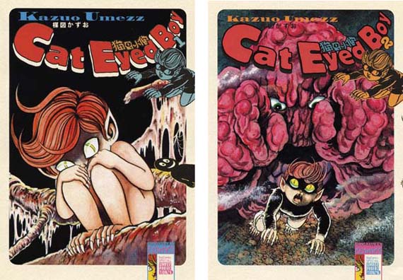
These are the covers for the “perfect” collections of the manga in Japan, which roughly correspond to the forthcoming English omnibus editions. They’re everything that I want out my classic manga. Solid illustrations, an eye-catching logo, a clarity of design, intent, and audience. It’s all really, really good… for Japan (and for me…).

Looking at it from a North American publisher’s perspective, there are some problems. Having a naked little boy on a book cover doesn’t fly in North America, for the most part (even if he’s got creepy claw feet). The book also looks a little young… Though its original audience is likely that same “Shonen Sunday” crowd as Drifting Classroom, in North America these are quite clearly going to be intended for an adult audience that is equally as likely to appreciate these works as viscerally enjoy them. (Though I feel it’s important to note that these re-releases were probably intended for an adult audience in Japan, likely the same adults who bought the stories as children originally). I’d love to own these two book covers, and chances are I’ll just pick them up next time I’m in Japan, either that or a nice Umezu art book maybe? But on North American shelves, they’d be pretty unlikely at best.

So what IS Viz cooking up for their North American editions of this material?:

cat-eyed-boy-viz.jpg

These covers are striking, bold, and graphic, but very different in style and tone than the Japanese editions, even though they incorporate original Japanese art by Kazuo Umezu. The acid magenta and cyan tones are just-about the most eye-catching colours you can print on a book without adding a special ink, implying that this is a book that the publishers really want to catch your attention. It also features the unsettling silhouette of the boy staring you down, which is pretty darned creepy (and attention grabbibng!). Very different… a much bolder statement about the work.

To discuss the changes between the two and maybe try and get some insight into the process, I conducted a short e-mail interview with Alvin Lu, Vice President, Pubishing, VIZ Media.

Christopher Butcher, Comics212.net: What led to VIZ Media considering the publication of Kazuo Umezu’s CAT-EYED BOY? Particularly in a format so completely different than other Viz Media releases… How do you expect readers to react?

Alvin Lu, Vice President, Publishing, Viz Media: VIZ Media is currently in the process of a long-held dream: gradually revealing to an English-reading audience a cross-section of the totality of the works of one of the 20th century’s greatest artists (all categories), Kazuo Umezu. Having completed our run of the long serial, the work many consider to be Umezu’s masterpiece, THE DRIFTING CLASSROOM, we are now embarking on releasing a representative earlier work, CAT EYED BOY, which we intend to publish, in swifter fashion, in its entirety. In the case of each of our Umezu releases, we consider the ideal format to feature that work. In such a long and varied career, a “one size fits all” approach is not necessarily appropriate.

This is a case where we would like the publisher’s motives and angles, and speculation over market reception, to be less the subject of chatter than simply the work itself. The work will speak for itself. Our role in the cases of these publications, which over time will be (and have already been) regarded as cornerstone works in the history of manga, is to feature the work to its best advantage.

Comics212: The trend in 2006-2007 was to collect older manga material in “omnibus” volumes. Did the relative sales successes of these omnibus editions affect your decision on the format for CAT-EYED BOY?

Alvin: The decision to publish CAT EYED BOY in this format was made around the time we decided to the same for TEKKONKINKREET. At the time, we had no real idea if the format would be viable in the marketplace or not, although it seemed to us that this would be ideal format to feature this work.

Comics212: The covers for the Japanese and English editions of CAT EYED BOY are very different, though the latter does incorporate elements of the former. Can you detail some of your decision-making regarding designing the English-edition covers? Do bookstore buyers influence your designs?

Alvin: VIZ Media wanted to create something exciting and strange, something that would make the book an object that wouldn’t be out of place within the manga itself. We do solicit and respect feedback from buyers, but over broader strategies. I can’t think of a case of soliciting feedback regarding a specific cover.

Comics212: Does Kazuo Umezu have any input into the English language editions of his work?

Alvin: When we first started discussions about publishing Umezu’s work there was more back and forth and yes, sometimes there is very specific requests on the proposed cover.

Comics212: Will the VIZ media editions of CAT-EYED BOY include any extras, along the lines of the “TEKKONKINKREET” release? Ie: original covers, posters, interviews, creator profiles, etc.

Alvin: Not on the same scale. As I said, the idea was to make the book as much an object as the contents of the book itself. The manga images themselves carry this out far more effectively than any other information… though there is an interview at the end of the second book.

Comics212: Finally, why should everyone pick up CAT-EYED BOY when both books are released June 17th?

Alvin: Because it is strange and beautiful.

It’s pretty clear that the content is a heck of a lot more important to Mr. Lu than the packaging, and in general I understand, though the art, design, and aesthetics of manga have become more and more a factor into my appreciation of the work. I think that the covers for the forthcoming English-language editions of CAT-EYED BOY are actually quite nice, fitting nicely into the design ideology for classic manga material defined by Vertical Publishing on their reprints of works by Osamu Tezuka, and Keiko Takemiya.

To be completely honest I was sold on CAT-EYED BOY before I saw any cover art at all. Umezu’s Drifting Classroom has been so consistently engaging and enjoyable over the past year that I can’t imagine not picking up everything released into English by this creator for as long as I’m buying comics. I think that the weight and heft given to this series by it’s massive binding and one-day release schedule will draw the right kind of attention to this work and continue to establish Umezu as a name worth knowing for North American comics readers.

– Christopher

Check The Viz English Edition Covers of Cat-Eyed Boy in a much larger size behind the cut:

Continue reading “CAT-EYED BOY: Bringing the Umezu classic to North America”

Limited Edition Manga T-Shirts…in Japan

ranma-12shirt.jpg

Oh man… Japanese clothing retailer Uniqlo is helping celebrate the 50th Anniversary of Shonen Sunday Magazine by releasing a year’s worth of limited edition manga shirts! The first 10 shirts were released for sale on Monday, and feature a range of classic and contemporary manga series, all priced at just $15 a pop! I can’t figure out how to order them internationally, which means that you’ll probably have to pick them up IN Japan. But if you can? Duuuuuuuuuude. You instantly become the coolest otaku in town.

Shown above is the Ranma 1/2 shirt in black, by Rumiko Takahashi. If anyone’s headed to Japan in the next little while, I take an XXL…

More shirts:

uniqloshirt.jpg

Ashitaka No Joe

cromartie.jpg

Cromartie Highschool!

gegegenokitaro.jpg

Ge! Ge! Ge! no Kitaro! (Nifty)

– Chris

Linkblogging: Good Food, Good Books, Good Art.

My friend Corey Mintz has started a food blog. It combines recipies, restaurant reviews done for Eye Magazine here in town, and food-related writing and remembrances. It’s good stuff, even though he disdains avacado.

Samurai Pizza Cats, by Eric KimMeanwhile, my friend Eric Kim has started up a blog about his art and comics work. It’s called [doublepeace] and so far there’s some nice stuff up there that was formerly posted to his LJ, now inactive. Add it to your RSS feeds and you too can see cool things like The Samurai Pizza Cats rendered in tiny pixels.

I’ve updated The Beguiling’s blog with a ton of stuff in the last couple of days. Art Spiegelman in Toronto April 3, Persepolis is playing down the street, we’ve got a sweet deal on TCAF posters, etc. If you’re in Toronto you should probably subscribe to our mailing list, it’s all good stuff.

The video game website Game Daily has a list of the top 10 Pokemon they’d like to eat. I always wonder about cartoon shows like that where there are talking, anthropomorphic creatures running around… What do the humans eat? Sure, Charizard and Pikachu will battle it out. But if the electric rat loses, is he dragon-lunch? Fantastic.

– Chris
Edit to fix link to Doublepeace!

New York Comic-Con: See you there…

For the third year in a row I’ll be at the New York Comic Con, April 18-20. Actually, I’ll be in New York from the 17th to the 21st, which should be fun and a little less _intense_. I do so ♥ New York.

I think I’m going to be participating in a few panels while I’m at the show, but so far as I can tell the programming isn’t live yet so maybe I’ll just shut my gob… Anyone who wants me for a panel or anything, let me know through the usual channels, chances are I’m up for it.

Oh, and I got pillaged ($$) for a hotel room, and if I weren’t splitting it it would suck. If you’re looking to book, book soon, a lot of places near the convention were selling out as I was booking today.

– Chris

Anime Thieves: You Are Awful People.

anhg01.jpgCustomer interaction 1 minute ago.

[Customer is a full-grown man(child) standing in front of one of the anime cases, jumping up and down. Ostensibly to see the top shelf.]

Chris: Bit of glare on the case I guess, can I help you with anything sir?

Customer: Do you guys have sales?

Chris: Usually on boxing day. That’s about it…

Customer: Oh, I want that anime but it’s too expensive. That’s why I asked if you have sales. You guys should lower your prices or I’ll have to download it.

Chris: Excuse me?

Customer: People will download it if it’s too expensive. You should lower your prices.

Chris: So if you walked into a store and didn’t like the price of a can of coke you would just rob them?

Customer: Oh… uh, I’m not going to rob you.

Chris: You’re going to rob the company instead.

Customer: Yeah.

Chris: That’s awful. That’s awful.

Customer: Uh…

Chris: You are awful.

[Customer sheepishly leaves store.]

End Scene.

– Christopher

PiQ Issue #1: Post-Mortem

piq-cover-small.jpgI think it’s important to point out that in the first issue of PiQ, the magazine calls its readership the following names: nerds, dorks, geeks, freaks, maniacs, and pervos.

They seem to mean these little bon mots with affection, but it does tell you quite clearly what the editorial staff thinks of its readership. Of course, the new magazine from ADV (nascent anime and manga publisher) is meant to replace Newtype USA, their former chronicle of otaku culture with a name and content licensed from the original Japanese Newtype magazine, and so some recognition that it is the hardcore fan who may be used to such derisive terms may simply be a way to ingratiate itself to the new readership. But it’s going to take a lot more than saying that we’re all nerds together and adopting the tagline “Entertainment for the rest of us” to convince me that they have anything to say, let alone that we’re all alike…

I previously covered PiQ magazine when I got my hands on the press-kit for the magazine prior to its release. The press kit broke down the aims of the magazine and their demographics quite clearly: they want men age 18-34. I’d say the magazine delivers on that promise, though they don’t quite realize that not every man in that demographic is interchangable…
I’m going to be upfront and say that I disliked the first issue. I’m not going to string you along listing good and bad before revealing my ultimate conclusion; PiQ Magazine #1 wasn’t very good. That out of the way, PiQ does have strengths to recommend it, and a lot of potential, but going by the first issue they’re going to have to work awfully hard to achieve any measure of success. It’s incredibly problematic and likely quite rushed, and with a lot of former Newtype readers already very, very angry at them, they’re going to need to improve, and quickly, to get a chance at long-term survival.

I’ve written an incredibly thorough page-by-page analysis of the magazine. It’s taken days to actually put it all together. I’ve included it behind the cut because people browsing here probably have no interest in a 6500 word essay on a magazine that they will never read, but when I say POST MORTEM I actually mean it. I am digging through the entrails of this thing CSI-style to find out what they’re doing and why. Don’t say I didn’t warn you, and you probably shouldn’t bother reading unless you’re really, really interested in the subject.

With that, click to continue: Continue reading “PiQ Issue #1: Post-Mortem”

More on Michel…

image01.jpg

image04.jpgJust a quick note that Michel Rabagliati got a very nice interview in The National Post today, in advance of his appearance in Toronto this weekend:

It must be cathartic, however, for Rabagliati to tackle some of the issues he does: For instance, Paul Goes Fishing follows Paul and his partner, Lucie, as they try to start a family. The book deals with the multiple miscarriages they faced, but Rabagliati says his partner was OK with him discussing such matters in a public forum.

“It was tough,” he says. “When you start drawing it, and you start drawing the blood … it really puts you back in this particular context. It’s pretty sad sometimes. I must confess, sometimes I get a little bit depressed or I cry a bit when I [draw] that.

“I like drawing these stories about real life. [But] that’s the problem with it: I have to deal with that.”

image02.jpg

I heard the event got a nice little mention in Xtra Magazine here in Toronto as well (Xtra.ca) but it’s not online, so you’ll have to go out and pick up a copy if you’re in the Toronto area. Thanks for putting up with my constant pimping of this event by the by, I’m quite excited about it and the books are among my favourites published by D&Q.
– Christopher

image03.jpg

Art from Top: Paul in the Metro, French edition cover for Paul Goes Fishing, a musical panel from Paul Moves Out, and a moment of regret from Paul Moves Out. He looks so cute in his Y-Fronts. 

PRADA IS JAMES JEAN: Comic artist covers spring collection.

prada-spread-purple.jpg

What’s comics about this picture? Give up? It’s James Jean, his illustrations bedecking the fabulous organza silk tunic and pant combo, inspiring the colours of all of the outfits, and acting as the canvas upon which these models are laid.

prada-spread-purple-detail.jpg

James Jean, cover artist for various popular comic series including Fables and The Umbrella Academy, and a comics creator himself whose work can be found in anthologies including the forthcoming Meathaus: SOS, has his art splashed across the spring collection from Prada.

prada-spread-bags.jpg

Jean’s first announcement of a collaboration with the internationally renowned fashion house came last summer, when he mentioned on-panel at the Toronto Comic Arts Festival (which I co-founded) that he would be designing a massive mural installation in the New York Prada boutique. The New York gig became New York and Beverly Hills, and the mural became the inspiration for an animated film/commercial for Prada, Trembled Blossoms, a unique animated affair that features the dark faerie designs and illustrations of Jean, set to a creepy ambient trip-hop soundtrack and featuring gorgeous creatures turning into shoes, frocks, and handbags.

katemoss-britishelle.jpg

The collection is huge, more than a hundred pieces including this organza silk fairy-print top modeled by the lovely Kate Moss and checking in at around $2200. While industry sites had made notice of Jean’s mural and film, no one (myself included) seemed to have noticed that James Jean’s palette, visual style, and even his actual illustration, is present across almost the entire line, and to be found in the pages of virtually every fashion magazine around the world. No one of course, except The National Post’s Nathalie Atkinson, who profiled Jean last month in a huge double-page spread that incorporated his commercial and fine art, as well as the new fashions that bear his art. Unfortunately, the spread that featured the art is no longer online, but do check-out the profile text which is still available.

prada-spread-gold.jpg

Curiously, Jean’s involvement feels like it is being kept from the limelight, with most of the praise resting squarely on the shoulders of Prada head Miuccia Prada. One of the few mentions I’ve seen of Jean’s involvement came from the New York Times Magazine, both in print and on their website (they loved the collection, by the by). But for anyone familiar with Jean’s illustration and comics work, it’s hard not to see the inspiration. Jean’s work even adorns the “IT” handbag of the spring, much as Japanese illustrator and artist Takeshi Murakami’s collaboration with Louis Vuitton defined couture fashion handbags several years ago:

prada-fairy-bag.jpg

The Prada Fairy Bag comes in square and round versions, and is apparently the must-have item right now. Completely sold out from the New York Prada boutique (the only place you can find it when you can find it), this site estimates that less than 15 people are “walking around the city with Prada fairies dangling off their shoulders.” If you can actually find one, it’ll run you $2,300.

21_shopobag_lgl.jpg

Finally, a piece of James Jean art that will get female collectors with a taste for the finer things as excited as the men. Is that sexist of me? Apologies.

oscarwinner.jpg

So who’s wearing James Jean’s prints on Prada this spring? Everybody. Shown above is Marion Cotillard, the actress who tackled the role of Edith Piaf in the film La Vie En Rose, an Academy Award-winning performance. Marion is showing off the printed silk organza skirt, $2,195, in this photo shoot for ELLE magazine.

shoecloseup.jpg

This chunky-heeled Runway Collection Mary Jane is pretty fierce, incorporating a floral design found in the original mural. A pair of these will set you back $790 from Neiman Marcus.

beguiling-20th.jpg

Now, I’ve got something of a vested interest in this post. As I mentioned at the beginning, Mr. Jean has been an Honoured Guest at the last two Toronto Comic Arts Festivals, and I hold his work in high esteem. James was even kind enough to accept our commission for a TCAF poster in 2005, and another in 2007 for The Beguiling’s 20th Anniversary Ltd. Print. I’m thrilled to see his work being so widely acclaimed. While this post is about his contributions to the world of high fashion, I’m also thrilled to see him moving more and more towards fine arts and traditional media. While I fear it might mean the end of his contributions to illustration (and comics…), it’s been fantastic watching him grow as an artist, from all the way back to when I first discovered his work in one of the early Meathaus publications. James’ blog is essential reading, and I highly recommend it.

canvas-bag.jpg
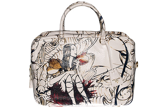
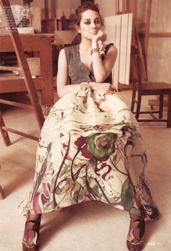
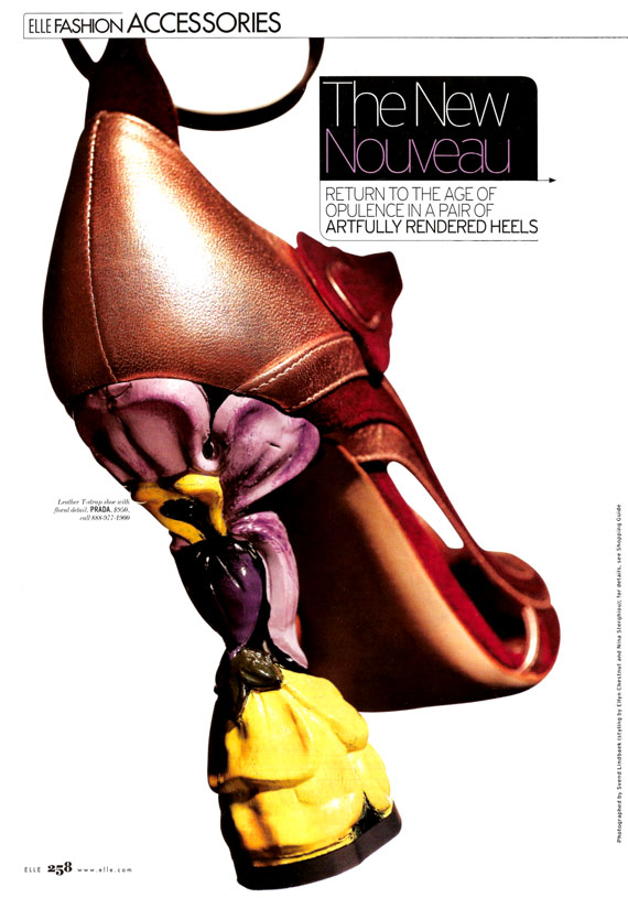
Prada is a big name–and big business! Their Spring line has been covered by everyone in the fashion world, which makes it very easy for you to track down the entire collection (at least online… you’ll need a swiss bank account and some very good connections to track it all down in the real world). The folks at Style.com have a fantastic slideshow feature on the collection, with the pictures (including some nice detail shots) and even a review, for those of you that need hand-holding into the world of haute couture.

I did.

Congrats to James Jean on this career milestone; not every comics creator can say they’ve had such a wide and prestigious distribution of their work (just him, Paul Pope, and Range Murata I believe). And for you die-hard collectors? You’ve got a whole new avenue of rare art to obsess over…!

– Christopher Butcher

Photo Credits from top: Prada Advertisement, Prada Advertisement (detail), Prada Advertisement, all ©2008 Prada. Kate Moss in Prada, photographed by Craig McDean from UK Vogue. Prada Advertisement, Prada Advertisement, all ©2008 Prada. Prada Fairy-print Bag image from nymag.com, ©2008 New York Media Holdings LLC. Photo of Marion Cotillard by Tom Munroe from Elle Magazine. Photo of Runway Collection Mary Jane by Svend Lindbaek, from Elle Magazine. Beguiling 20th Anniversary Image by James Jean, ©2008 The Beguiling and James Jean. Fairy Canvas Bag product shot. When not explicitly stated, copyright is unknown but is generally assumed to rest with the photographer mentioned.