Limited Edition Manga T-Shirts…in Japan

ranma-12shirt.jpg

Oh man… Japanese clothing retailer Uniqlo is helping celebrate the 50th Anniversary of Shonen Sunday Magazine by releasing a year’s worth of limited edition manga shirts! The first 10 shirts were released for sale on Monday, and feature a range of classic and contemporary manga series, all priced at just $15 a pop! I can’t figure out how to order them internationally, which means that you’ll probably have to pick them up IN Japan. But if you can? Duuuuuuuuuude. You instantly become the coolest otaku in town.

Shown above is the Ranma 1/2 shirt in black, by Rumiko Takahashi. If anyone’s headed to Japan in the next little while, I take an XXL…

More shirts:

uniqloshirt.jpg

Ashitaka No Joe

cromartie.jpg

Cromartie Highschool!

gegegenokitaro.jpg

Ge! Ge! Ge! no Kitaro! (Nifty)

– Chris

PiQ Issue #1: Post-Mortem

piq-cover-small.jpgI think it’s important to point out that in the first issue of PiQ, the magazine calls its readership the following names: nerds, dorks, geeks, freaks, maniacs, and pervos.

They seem to mean these little bon mots with affection, but it does tell you quite clearly what the editorial staff thinks of its readership. Of course, the new magazine from ADV (nascent anime and manga publisher) is meant to replace Newtype USA, their former chronicle of otaku culture with a name and content licensed from the original Japanese Newtype magazine, and so some recognition that it is the hardcore fan who may be used to such derisive terms may simply be a way to ingratiate itself to the new readership. But it’s going to take a lot more than saying that we’re all nerds together and adopting the tagline “Entertainment for the rest of us” to convince me that they have anything to say, let alone that we’re all alike…

I previously covered PiQ magazine when I got my hands on the press-kit for the magazine prior to its release. The press kit broke down the aims of the magazine and their demographics quite clearly: they want men age 18-34. I’d say the magazine delivers on that promise, though they don’t quite realize that not every man in that demographic is interchangable…
I’m going to be upfront and say that I disliked the first issue. I’m not going to string you along listing good and bad before revealing my ultimate conclusion; PiQ Magazine #1 wasn’t very good. That out of the way, PiQ does have strengths to recommend it, and a lot of potential, but going by the first issue they’re going to have to work awfully hard to achieve any measure of success. It’s incredibly problematic and likely quite rushed, and with a lot of former Newtype readers already very, very angry at them, they’re going to need to improve, and quickly, to get a chance at long-term survival.

I’ve written an incredibly thorough page-by-page analysis of the magazine. It’s taken days to actually put it all together. I’ve included it behind the cut because people browsing here probably have no interest in a 6500 word essay on a magazine that they will never read, but when I say POST MORTEM I actually mean it. I am digging through the entrails of this thing CSI-style to find out what they’re doing and why. Don’t say I didn’t warn you, and you probably shouldn’t bother reading unless you’re really, really interested in the subject.

With that, click to continue: Continue reading “PiQ Issue #1: Post-Mortem”

Japan 2007: Shibuya, Tsutaya, Ginza, Ramen Museum, Macadonaru, The End

dscf4671.jpg

The thing about Japan is, it’s where I’ve always wanted to go, and having been there, part of me thinks that it’s where I want to be. That’s not to say that I’m blind to the socio-economic realities of what that means; I’m aware that even the most acclimatized westerner is still gaijin, and that it would never really be my home the way Canada is. But Japan is, in many ways, the realization of many of my dreams about comics and culture, and about society as a whole. I can’t say that a day has gone by since I got back that I haven’t thought about returning. I feel like I only scratched the surface of the country during my last visit there, and despite frequently being hot, sweaty, tired, and wet (typhoon!), I was never, ever bored.

This is my last Japan Travelogue post, bringing us right to the end of my trip. The last two days marked a significant downturn in the lack of pictures taken, owing partly to the novelty of picture-taking wearing off a little, and partly due to the fact I lost the camera. Well, heh, I actually left it in the Ramen Museum overnight and had to rush back to Yokohama on the day of our flight out of Japan to pick it up.

dscf4664.jpg

Incidentally, I’d like to thank everyone for reading and enjoying these posts, particularly the people who’ve told me that they never had any interest in visiting Japan until visiting my blog. That means an awful lot to me, that’s why I’m here really: To Share The Joy. 🙂

With that, click “continue reading” to find out about my last two days in Japan.

Continue reading “Japan 2007: Shibuya, Tsutaya, Ginza, Ramen Museum, Macadonaru, The End”

Review: Tokyo Is My Garden

cover_lit.jpgTokyo Is My Garden
By Benoit Peeters and Frederik Boilet, with Jiro Taniguchi
$18.99, 152 pages
Published by Fanfare/Ponent Mon
http://www.ponentmon.com/new_pages/english/princ.html

Brigid at Mangablog called me out regarding my appreciation for Tokyo Is My Garden, a 2007 release by Fanfare Ponent-Mon and, like most of their releases, doomed to obscurity for some reason. Well I didn’t take her up on her challenge due to my blogging time being cut short as of late, so she just kicked me in the butt and posted her own, very balanced, review of Tokyo Is My Garden. I have a little bit of time on my hands while at work (hurrah for dinner-breaks) so I figured I’d link to Brigid, but also talk a little bit about why I enjoyed the book so much.

First though, I want to complain about Iron Chef America, on The Food Network.

Despite loving show host Alton Brown and being happy to see fellow Canuck Kevin Brauch on the screen, I find the whole thing to be so much lesser than its Japanese counterpart and originator. It’s considerably more crass, with less of a sense of humour or pagentry, making up for it with bitchy reality TV nonsense. The worst part though, the part that just grates on me when I watch it, are the judges and their inability to be anything but literal and low-minded when it comes to their duties. The role of the judges is to determine how well the chefs articulate the theme ingredient in their dishes, but the most common and common complaint of the judges is that “I can’t taste the theme ingredient!” If it’s bacon then the dish isn’t bacony enough; fish isn’t fishy enough; leeks are “overpowered” by the other flavours. Admittedly some judges are worse about this than others, but for the most part, the judges seem to believe that the only way to articulate an ingredient is by having the dish scream out that flavour above all others.

Where’s the subtlety? What about articulating the theme ingredient through… I dunno, the texture, like the real Iron Chefs do (wherefore art though, Kenichi-sama?). Or in the subtle melding of flavours? Or just for colour? Is the only facet of cuisine the purest and brightest essence of what its cheif ingredient? Or is food subtle, layered, and surprising? The answer is the latter of course, because if it weren’t, than the Jones Soda Turkey-flavoured holiday soda would be available all year round! Everyone likes turkey, why wouldn’t they want it concentrated in carbonated form, right? Because there are other facets to eating, and to enjoying a meal obviously. But try telling that to an Iron Chef America judge. Dicks.

Right! So, why did I enjoy Tokyo Is My Garden so much? For its sweetness, its sense of place articulated by its lovely art. Because it is a story of young love where the challenges the lovers face are internal. Early on in the book, the characters talk about “sad French novels” and the book is quite conscious of being a sad French graphic novel throughout, brilliantly turning those expectations on their head through a number of plot contrivances that evoke the classic romantic comedies of the 1940s through the 1960s. A happy ending and the sort of gentle redemption that comes from the various characters’ gentle transgressions. It reminds me a lot of the work of Dupuy & Berberian actually, a sort of upper-middle class existence in a fabulous city, where the characters tribulations are largely due to their personality quirks and their fears and inadequacies. It’s a fantastic change of pace from the melodrama of most manga (let alone most commercial graphic novels). A smart, funny, romantic romantic comedy.

But, the plot! There isn’t enough plot! I understand Brigid’s criticisms, that the plot is ‘thin’ but I don’t agree (obviously). Rather, the plot is thick enough. The plot doesn’t need to scream at you, in my opinion, for a book to work. What is the best way to articulate the themes and aims of your story? Sometimes it isn’t a bold, bright, forthright “flavour,” but rather subtlety. Sometimes it is the texture of the relationships, simple clues about how people interact (the lead and his French boss, the lead and his girlfriend, the boss and the rest of Japan) that generates the friction that drives the story forward. The colour! The interplay! Were this story a contemporary manga (rather than nouvelle manga, as the author calls it) I feel that it would be told quite differently, the stakes much higher and the action more intense! If it were published in North America I feel it might read exactly like one of those terrible 100 page “film treatments masquerading as a graphic novel”. If it were a film made today, I feel like it might end up exactly like the sort of uninspired tripe that A.O. Scott talks about in his review for this weekend’s “Fool’s Gold.” (Thanks to David for the link). Instead, we have a delightful hybrid French/Japanese graphic novel that, when I put it down, I feel great about having read. A book that I made my husband read and he similarly enjoyed. A book that I wouldn’t hesitate to recommend to you. That’s not to say that I don’t understand why it felt a bit flat for some reviewers, I do, but I think it comes down to the expectations of story that you bring with you to the table. It may be why Dupuy & Berberian’s Get A Life and Maybe Later didn’t set the blogosphere on fire either…

I think that if I’d never seen Iron Chef in its original Japanese incarnation, I’d be far more charitable to its American sequel. But I know that there’s a show out there that is just more enjoyable, where the judges have a greater and more nuanced appreciation of food, and it makes it hard to watch Mo Fucking Rocca blather on and on about nothing, only present to resuscitate his own failing career. Likewise, I think I appreciate the light touch of Tokyo Is My Garden, the gentle appreciation of a beautiful city, a beautiful young romance, and the cultural differences that separate and ultimately unite us.

– Christopher

Japan 2007: Nakano Broadway Mall

dscf4533.jpg

Nakano Broadway Mall is pretty darned cool. Located at Nakano JR Station just a few stops from Shinjuku, Nakano is your typical Japanese mall, except 75% of the ‘typical’ stores have been replaced with shops aimed squarely at hardcore otaku. From the arcade areas to the original art and animation cells to the manga and the toys to the idol goods and video games… just fucking everything. You will spend a fortune, nerd, so be sure to bring one with you.

I had such a good time here. To see some of the amazing stuff we found at the mall (like that original Tezuka sketch up top going for $1500 or so), just keep reading.

Continue reading “Japan 2007: Nakano Broadway Mall”

Bryan Lee O’Malley’s Shojo Beat Cover

bryan-omalley-shojo-beat.jpg

In a confluence of fortuitous circumstances, Mal is doing the cover to the March issue of Shojo Beat, which is dropping in (I think) a few weeks. Lovely little cover. Head over to Bryan Lee O’Malley’s livejournal to find out just what other surprises await you in The Art Issue.

kean-star-frontpage.jpg

In other my-friends-are-cool news, our event with Kean and Kazu got picked up at BlogTO and even made it onto the front cover of The Toronto Star, in an article on young readers graphic novels!

Good day.

– Chris

Tekkon Kinkreet Update

Tekkon Kinkreet All In One Edition

Just as an FYI, we’re down to 5 copies left of the new edition of Tekkon Kinkreet by Taiyo Matsumoto here at The Beguiling, from our initial order of 100. So, you know, 95 copies in 5 months, not bad. I’d been slacking at recommending it lately and when I remembered it I hand-sold another 5 last week. I’m gonna try and sell out by Friday, wish me luck!

– Chris

Black and White Movie - Tekkon Concrete

P.S.: You really should buy it.
P.P.S.: For comparison’s sake, we’ve sold about 250 copies of Naruto Vol 15, which debuted at around the same time. At its $30 price tag though, Tekkon made us more money.
P.P.S.: I didn’t even buy a copy! Viz gave me one. 😀

Japan 2007: Shinjuku Kinokuiya Books

dscf4444.jpg

Hey there! Welcome back to the photo-tour of my trip to Japan. In case you’re just joining us, it took place between the 3rd and 15th of September, 2007. You can see all of the previous entries by clicking: https://comics212.net/category/japan/.

…so right after we get back from our sojourn to the Kansai area (Osaka/Kyoto/Nara/Himeji), we decide to head out to Shinjuku. In retrospect this was a huge mistake, because Shinjuku is a massive area of town with the JR Train Station right in the center, and really, it’s the hub of everything. To the west of the station is Tokyo City Hall and the financial district, to the east is Kabuki-cho, the naughty area of town. To the south though is an awesome building that combines a Tokyu Hands (see our Ikebukuro entry from much earlier for more on Tokyu Hands), a Takashimaya department store, and a massive 8-floor bookstore, Kinokuniya Books. Kinokuniya is probably best known in the west as the best place to get all of the cool untranslated manga, and they’ve got outlets all over the country. In Japan though, it’s just the largest bookstore there is, with the Shinjuku flagship store weighing in with 8 massive floors, including an entire floor more-or-less dedicated to English-language books.

We got to Shinjuku late as it was, and then spent 2 hours at Kinokuniya (when honestly, we could’ve spent a whole day). We should never have tried to do this on so little time. What were we thinking? Next trip we’re going to explore more of Shinjuku, but we also might just plan for a good 6 hours at this bookstore.

Continue reading “Japan 2007: Shinjuku Kinokuiya Books”

First Look: ADV’s new PiQ Magazine Media/Vendor Kit

I got my hands on a copy of the media kit for ADV’s new magazine PiQ. Since I didn’t see any note of this over at Brigid’s always-excellent Mangablog (http://www.mangablog.net/), I assumed no one else has posted about this yet. So let’s pour over the entrails together, shall we?
Designed to replace the popular Newtype USA, PiQ (pronounced “peek”) (although I keep saying “pie-cue” whenever I see it) is taking a hard line away from the beleaguered anime industry and branching out to be the high-end American Otaku lifestyle magazine of choice. Why? Well, as I mentioned the anime industry may have had its worst year ever in 2007 (although I see them regrouping and putting it all together in the second half of ’08), and because as Naruto has shown us, Japanese culture is more than just anime (or manga), and with North American iterations of previously Japanese-only endeavours like Capsule Toys, Manga, Gothic Lolita Culture, and anime making their mark on the nerd-culture industry, it looks like a license of a Japanese magazine covering a troubled industry just wasn’t going to cut it, going forward.

But the question is, will PiQ?

The PiQ media-kit I received included a letter from Publisher Gary Steinman, outlining the major changes that the magazine will undergo. It’s very important to note that throughout all of the commentary I’ve seen from ADV on this matter, including the media kit, PiQ is being treated as a name change to Newtype USA, and not as an entirely new magazine. While I have no firm answer as to why this is, I’d speculate that declaring it to be the same magazine but with a name change (not to mention a substantial format change…) means you get to maintain your existing distribution and subscription arrangements. But it’s pretty clear that the new boss ain’t the same as the old boss.

For starters, the magazine will shrink in size, both in physical dimensions and in page count. The new physical size is 8″ wide x 10″ tall, as compared to Newtype’s 9″ x 12″. The latest issue of Newtype weighs in at 160 pages, and the info for PiQ seems to be saying it’ll drop at around 130 pages. The price is also much lower, with the new magazine retailing for US$6.99/CDN$7.99, versus $12.98/$16.98 for Newtype. Oh, and the magazine will be perfect-bound rather than stapled, which means it’ll have a spine! No more free DVDs with each issue either, so far as I can tell. The big format change? PiQ will drop Newtype’s right-to-left Japanese reading orientation in favour of a standard left-to-right orientation. Essentially, the otherworldy Japanese “object” that was Newtype USA is gone, to be replaced by something that very-much resembles Wizard in size… and in tone.

According again to the Media Kit, the new editorial breakdown for PiQ will be:

    • 20% Anime
    • 20% Gaming
    • 20% U.S. Comics / Japanese Manga
    • 20% Genre Movies / TV / Home Video
    • 10% Toys / Collectibles
    • 5% Gadgets / Hi-Tech Gear
    • 5% Lifestyle (fashion, accessories, events)

Apparently PiQ is “entertainment for the rest of us, squarely addressing the needs of a cutting-edge young male audience,” and they’re estimating a 70/30 split in readership, in favour of male readers. This reads to be to be very, very similar to Wizard magazine, a jack-of-all-trades scenario.

Some final stats from the presentation:

    • PiQ is expected to have a 100,000 circulation at launch, with a target circulation of 150,000 by the end of 2008.
    • PiQ will launch with 15,000 subscribers, all of which are former Newtype USA subscribers. So, now you know how many people subscribed to Newtype.
    • The first issue of PiQ goes on sale March 18th, 2008.

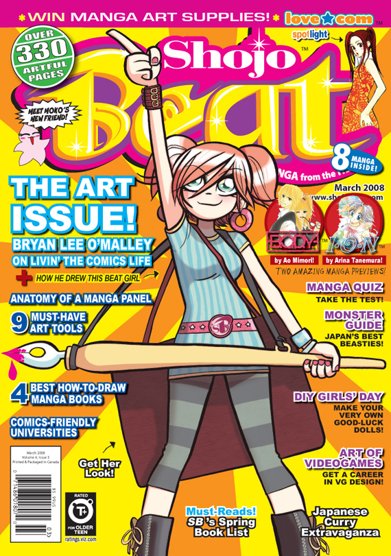
Also included with the material I received, twice, was a mock-up of the first issue over. As noted on the cover itself this is a cover concept only, and is not necessarily going to be the final cover. However, it pretty clearly shows where the magazine is headed, and while it may have the bearing of Wizard, it looks an awful lot like video game magazine PLAY (which I love and is awesome). Lets take a look:

PiQ Issue One Concept Cover - Copyright 2008 AD Vision Inc.

PiQ Issue One Concept Cover – Copyright 2008 AD Vision Inc.

So, what do we see here? Well, the first and most telling thing is the comparison between this cover and the most recent Newtype USA. Where Newtype USA Jan 2008 features the names of tons of new anime series (at least two dozen by my count), an anime creator profile, an anime art book, and the words “Anime, Manga, Games, Music, more!” the focus on the new cover is all over the place. A Tokyo Travelogue! Cosplay! Anime! But also video games and LOST and Battlestar Galactica and Red Hulk and the promise of bulleted lists! (No manga?)

So there you have it, the inside scoop on (what might be) the first issue of PiQ. All you have to go on about this magazine being the same one as Newtype USA is the publisher’s say-so, with the magazine looking significantly different, and more generic, than what has come before. But honestly? This is probably a really smart move on ADV’s part, with magazine publishing being almost entirely advertising-driven, opening up your mag to the extremely lucrative advertising of the extremely lucrative video game field makes a hell of a lot of sense, and ending a licensing agreement for a magazine’s name and content that may or may not be contributing to your bottom line anymore? The same. The only thing up in the air is what the fans, anime fans, Newtype buyers and subscribers, are going to think of something that isn’t quite as OTAKU as they were hoping for. Hey, there’s always Otaku USA for you Otaku out there!

Still, I’m looking forward to the first issue. I think that, much like the comics industry needs something like COMICS FOUNDRY, it also needs something like this to supplant the rampant misogyny in Wizard’s magazine… Good luck guys.

– Christopher