 I hesitated posting about today’s big DC “news”. I did it yesterday and I kind of don’t want to make a habit of giving them a lot of attention—negative or otherwise—because they’re a multinational corporation who doesn’t need it when I could be focusing on excellent books from smaller publishers. It’ll do wonders for my hits though. And seriously, as much as I love posting about something just to rag on it, I’m a genuine fan of the artist of this cover, JG Jones. I own lots of his comics and think he’s a really talented artist.
But.
But this cover is already out to a wide lead for “ugliest comic book cover of 2010,” and… and I gotta say something. Maybe there’s still time.
The 5 Things Wrong With DC’s War Of The Superman #0 Cover:
“FUCK YOU, DAD!”
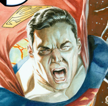
1. Superman should not look like a petulant teenager. He also might be cross-eyed here.
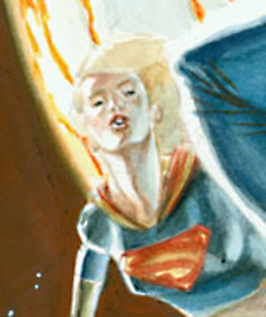
2. Supergirl is making a kissy-face on the cover. Seriously. All the dudes on the cover are angry or serious, the girl on the cover is giving her best come-hither. The teenage girl.
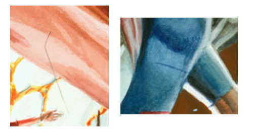
3. Are those seriously hairs on the art? Like the art that DC released today was scanned with hairs on the scanning bed?
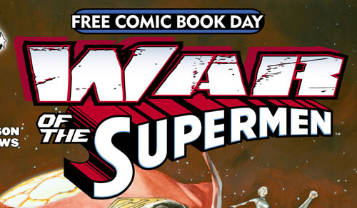
4. Not Jones’ fault (I hope), but that logo is terrible. There are 3 different fonts in that logo. WAR has 5 different text effects on it, including a bevel. Bevel. Bonus problem not related to the design: I seriously cannot believe this is DC’s entry into Free Comic Book Day.
5. It’s just not a good cover. Washed out, oddly static, the figures aren’t moving in the same direction and don’t come from even roughly the same point, the expressions don’t match up, it’s poorly ‘blocked’ meaning it looks like the woman in the upper-right corner looks like she’s standing on Superman’s shoulder… The whole thing feels like it’s been art-directed to death, or not at all. I can’t tell which.
I have solicited comics before, for free comic book day. You gotta get the art in early to make a very early deadline for a May book. Maybe it’s just rushed, or otherwise not the final. Or maybe this really will be the ugliest book DC releases in the new year.
– Christopher

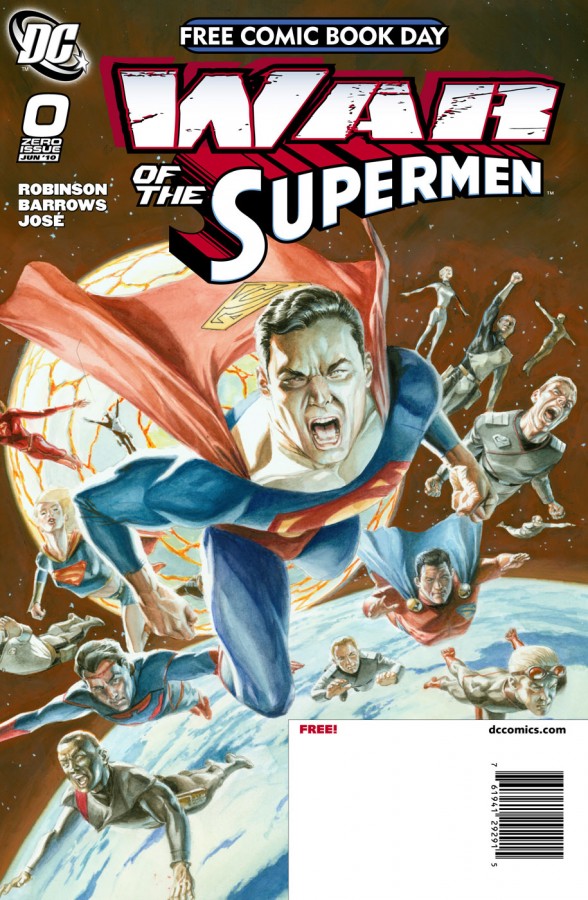
Free Superman comic, you are too ugly to take home. I do not want to make you breakfast the next morning.
Maybe the woman on Superman’s shoulder is a cross-dressing Atom, y’know, riding shotgun on his shoulder like in the old pre-rape days? Or then again, it could be the new Atom, you never know with these superhero comics anymore, it could be the New Dead Teen Bi-Curious Alcoholic Female Atom. Wait, the Atom isn’t a Superman, so he can’t be in the War of the Supermen. Unless it’s a Kandor bottle blonde. Or New Dead Teen Female Bi-Curious Alcoholic Super Atom Man.
What I want to know is, why are they flying away like that, shouldn’t they all be warring with each other? Hello, it’s called War of the Supermen? Like, punching and shit? That’s Flying Lessons of The Supermen, up there. Cruising With The Supermen. Not a war. aI’ve seen war on TV,nd that’s not war. That’s…I don’t know what it is. It just isn’t war.
And speaking of the War of the Supermen, shouldn’t DC be worried that there will be complaints that the book isn’t called War of the Superpersons? I sure hope Superboy isn’t in it, because that will mess up continuity for weeks, because, I mean, after all, really now, come on, I checked Wikipedia, he’s a Super-boy, not a Super-Man.
I’m not buying it if Superboy is in there because it just ruins the suspense of disbelief, y’know?
Hold the phone — why are they all making those faces? Are they upset because they’re not at war? Are they practicing their “war faces”? Without a mirror? I guess with super-vision they could be using mirrors on distant worlds, okay, you got me on that one, that’s a good point there. But they look like they’re all screaming along with some Slayer or Cannibal Corpse song or something like that that makes singers look like that when they sing along, all angry, like war. I’m not up with that concept at all, that’s like mixing genres. I think DC’s making a big mistake there.
(sorry Chris, I’m tired and punchy. I’ll stop now)
Seriously, though, what’s with Superman’s right arm, anyway? And no Bizarro Superman? Pfft. Wrong.
@Evan:
I can’t believe you said “Kandor bottle blond”.
I mean, I love that you said it, but still.
Wow, they’re really doubling-down on the whole least-popular-Superman-story-in-years thing. That’s guts.
Nice.
I’ve always thought Jones’ work was overrated anyway.
YOU JUST DON’T GET IT! FUCK YOU, DAD!
#6: Why are they all screaming (minus Supergirl, of course)? Is there suddenly sound in space?
Yikes. It’s not even rendered very well. Sorry, whoever painted that, it’s not very good.
Well, what does anyone expect with the usual rates artists get from comic book publishers these days? I don’t think most of them can afford the really good artists anymore… they have to save as much as they can on everyone else so they can pay Alex Ross and Marko!
Maybe it’s a comp.
Repeated from Newsarama:
I know that I truly and finally have “Event Fatigue,” the real deal, because seeing this announcement, and seeing yet another cover, featuring yet another grimacing, yelling (in space!) superhero (Superman, himself, of all people)–I say, seeing these things, I experience a gaping, sucking, painful void in my stomach. If not for the balance given by the positive news, as I choose to take it, of the Superman and Batman: Year One projects, I would find this to be a dismal week for comics, indeed.
But I like Evan Dorkin’s and Tim O’ Neil’s posts better.
I don’t know anything about Jones’s process, but it looks more like a study for a cover, (or something to be scanned into Photoshop and enhanced/retouched). Regardless, it’s clear that the DC art department needs a fresh set of eyes.
Oh god, Evan’s comment killed me. I am laughing and crying over here. XD
And yes, Ugly Cover is Ugly.
What are those black dots on Supergirl’s chest? Did an intern drawn nipples on her after the fact?
I can’t tell if those are hairs or someone doodling on the art.
To paraphrase the Joker, DC pulled a boner.
“I seriously cannot believe this is DC’s entry into Free Comic Book Day.”
Hah, who are you fooling. Yes you can believe it! I mean we’re almost on a roll this week. Two days left; can DC announce something else that’s brain-dead, for the hat trick?
You are correct that it’s downright awful.
– Supergirl’s neck is disgustingly thick and long. Her expression is just embarrassing.
– Even with foreshortening, Superman’s giant-ass head isn’t doing it any favors and serves to make his body look scrawny and strange. Even if that perspective is possible it’s not communicating the kind of stance and strength of Superman as a character.
– The extra short sleeves on his shirt make it look like he’s wearing someone else’s outfit.
– The amount of reflected light in his hair makes it almost look grey and old.
– All of the line art has been painting over or faded back except the yellow superman symbol on his cape, so it’s popping forward quite oddly.
– The belt buckle is ‘tangenting’ hard with the Superman symbol to make it look like he has a lumpy large nipple. add in that brutal tangent of the flying woman standing on his shoulder and it’s a full-on WTF.
I like how the black guy on the bottom left is doing push-ups on the planet prop below.
Also, Supergirl looks like Debbie Harry. I think she’s singing “Rapture” during it. “Superman went back up to space, where he won’t have a hassel with the human race. And you hip hop.”
If I had to draw a cover to a book written by my ex’s new husband, I wouldn’t be motivated to bring my A-game either.
Well, at Least Superman isn’t holding a dead body and crying like the last 20 years of events at DC.
Everybody looks very skinny, maybe they’re angry because they don’t have enough food. Supergirl’s dot-black-accentuated-nipples are an odd choice for a free comic book day release.
The guy with the googles…if you aren’t going to wear them in space where are you going to wear them?