 Casanova #3
By Matt Fraction and Gabriel Ba
$1.99, 16 pages, Two Colours
Published by Image Comics
Reviewed by Christopher Butcher
PREVIOUSLY IN CASANOVA
 Casanova Quinn—a bon vivant in two different timestreams—is kidnapped from his home in Timeline 909 and forcibly brought here, to Timeline 919, to serve at the behest of superterrorist Newman Xeno, leaders and CFO of gloom-and-doom corporation W.A.S.T.E., to betray his own father, Cornelius Quinn, the strongly-jawed and ruggedly-moustachioed leader of E.M.P.I.R.E., known to you and me as the good guys.
 Where Cass comes from, he’s the bad egg and his twin sister Zephyr was the apple of E.M.P.I.R.E.’s eye—but in the 919 she rolls suspiciously more sinister, usually draped on Xeno’s arm, and is just aching to put the screws to daddy. And wouldn’t you know it, here it’s Cass that’s the big hero, so in he slips to E.M.P.I.R.E. to act as his own evil twin.Â
 Tasked by E.M.P.I.R.E. to infiltrate exotic Agua Pesada and retrieve a deep-cover agent named Winston Heath who had gone several degrees south of crazy, and counter-tasked by W.A.S.T.E. to kill Heath, Cass was trapped between a rock and a dead place. Killing Heath in self-defence and destroying his compound, Cass then shot his sister and left her bleeding on a rooftop while Agua Pesada went shithouse.Â
 And as he made his great escape, Cass asked Zeph the one question she’s dreaded having to answer:Â
 Where’s Mom?
    – Matt Fraction, Inside front cover of Casanova #3.
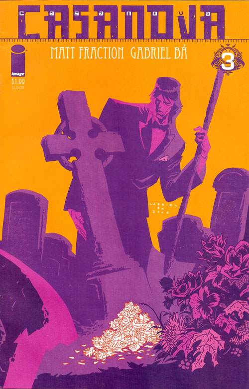
It’s been three issues and I haven’t actually talked about the covers to the series. I’ve been including them with the reviews (or as Gabriel Ba described them, analyses,) but the covers themselves are so completely different than the interiors and yet complimentary too. Not to mention ballsy as fuck starting next issue. But yeah, the sickly-green that tones the interior art is kept as far away as possible from the sixties acid-orange, lush grape, and black and white that stain the covers. The cover illustrations eschew black linework entirely, opting instead for bold graphic shapes and characters composed entirely of colour. It’s a gorgeous effect, the comics look like nothing else on the stands. Each of the first three covers also includes the tiniest little bits of red accent, which totally pop and provide a delicate counter-balance to big bold areas of colour. I’m curious how much of the covers are designed by series artist Gabriel Ba, and how much of the design comes from author Matt Fraction, an accomplished designer in his own right who has a few things to say about cover composition. Matt, if you ever feel like doing a whole bunch of unpaid work, I’d love to see some writing about comic cover design (and Casanova’s design in particular).
 Meanwhile, story structure happens! In this issue Fraction plays with threes; the story comprised of three inter-related 5 page vignettes with a one page epilogue. The three stories are Right Now, 7 Days Ago and 97 Days Ago, and each story arc/time period also corresponds to a different ‘side’ of Casanova in this new timeline: His Own, E.M.P.I.R.E.‘s, and W.A.S.T.E.‘s.. The story cycles through the three storylines, a page from each until the issue is over (plus the one-page epilogue). The stories are chronologically distinct, each following it’s own order of operation and taking place at a different part in the overall timeline. However, just for shits-and-giggles, I went back and re-read the story not as it’s presented, a page from each thread at a time, but the whole thread from start to finish. It helped open up my thinking on this issue. Anyone can tell three five-page stories and then just shuffle ’em up, but then it’s just crap. This issue works like a 15 scene short film, each page a whole that works within the larger whole of the issue (sort of like how each issue is distinct but works within the larger context of the 7-issue series). What’s really phenomenal is that each page/scene is cognizant not only of the scene that follows it from the other storyline, but of the next scene in the story arc as well! For example, Page 1 ends on special agents Kennedy and Johnson telling Cass it’s time to go and get the show on the road, a pretty effective way to jump-start the issue. The next sequential page has Casanova in front of E.M.P.I.R.E., seven days ago, being returned to active service, which fucks with your head a little by implying that K&J brought Cass to the E.M.P.I.R.E. tribunal, even with that big SEVEN DAYS AGO at the tip of the page. The next page in the story arc though, features Cass, Kennedy, and Johnson out on the road in their convertible the story flowing along marvellously and not suffering a whit for the two pages of different storylines between them. Good stuff.
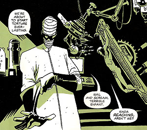
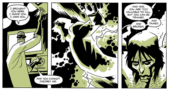
The other strong bit about the issue brought about by the story structure? The one so obvious it’s right under your nose: Telling a successful story where each scene is exactly one page long. In his previous writing about comics writing, Fraction has talked about the rhythm of a story, of the page. Here the rhythm is very consistent and aided by the scene-per-page rule, resulting in a sort of a meditative lull inspired by the quiet, reflective nature of the Right Now and 7 Days Ago sections, and then gloriously interrupted by the sharp intense shocks of the 97 Days Ago pages (Revelations! Torture! Sex! Violence! More revelations!). Sort of a bum-bum-BAM-bum-bum-BAM sort of a thing. Neat stuff, and I’m kind of surprised that Fraction didn’t dig into that more in the back-matter, as I think this issue probably makes for the clearest and easiest-to-follow learning-aide for “story beats” of any comic I’ve come across.
So, yeah, on one level coming up with a structure and then trying to force a story into it is wankery; the exact opposite of art and entirely artifice. But on the other, sometimes it works too, and as long as the story manages to cover it’s ass and remain internally consistent (it does) and thematically consistent (it does) then why not, you know? The results are great; don’t listen to McKee because it turns out there’s more than one way to tell a successful story after all.
But… speaking of the back-matter, it lets loose a wonderful little secret that never was: this three-focussed issue was originally intended to have three unannounced variant endings! I love shit like that, it’s even better than having 13 variant covers on Gen 13 #1. Apparently printing variant interiors is more expensive than one might expect, and so (sadly) the idea was scrapped. The rest of the back-up material included this issue shows the reader how Matt Fraction turns a fun day in San Francisco into an issue of Casanova; a neat trick.
I want to state for the record that I do enjoy the storytelling, but I find that my mind craves order and I’m having a hard time intuiting why the creative team is making certain storytelling decisions. The big issue for me is that Casanova’s visual storytelling is based on a 4-tier page: 4 “rows” of panels each. To explain via famous example, Alan Moore and Dave Gibbons’ Watchmen is based on a 3-tiered page, and more specifically a 9-panel grid of 3 panels on each tier. Reading an issue of Casanova, it seems that the 4-tiered approach seemingly disappears at random, sometimes having 2 of the tiers compressed into one creating a differently balanced page, or sometimes featuring three equally weighted tiers. It took me three issues to really notice that the storytelling structure in that regard wasn’t consistent, so it’s probably not even a problem so much as a ‘quirk’, but part of my brain is craving a more consistent application of this structure so that when it is broken it’s really notable and affecting. I dunno. Maybe Ba’s style just resists a rigid grid (though he used it to amazing effect last issue in the fight-scene between Casanova and Winston Heath), maybe it’s just not what the series creators want. But it is noticeable…
As to where this issue fits on the whole? If issue one was puberty, the lead character being forced into a strange new status quo, and issue 2 was a young man testing his boundaries, then issue 3 is all about the punishment; reproach. But the punishment is all for his own good and no one goes home mad at the end of the day (heh). And pretty soon, our boy’s going to start being interested in girls…
– Christopher Butcher


The page structure thing, I’m pretty sure, comes out of “classic years” Franco-Belgian, which tended towards four tiers without being dogmatic about it.
Chris, mate, these are some damned fine reviews. Like a lot of older readers I’ve slowly stopped picking up monthlies and going instead for collections, but this makes me wish I had picked Casanova up issue by issue. Hope you don’t mind, I had to pinch a bit of one of your reviews for a quote on our blog to point folks over here to read the rest.
Joe
Joe- Not at all sir, thanks very much for the link. I hope what I’m doing sells some Casanova’s for you…!
Warren- Could you recommend a few examples of such? We’ve probably got them in the store here even, I’d like to check some of them out.
Chris, the four-tier thing; if you look at Asterix for example, it´s a very rigid, almost religious, 4-tier grid. Hergé too, I´m pretty sure, but I don´t have his books here right now, so I might be wrong.
On the other hand, Franquin in his Spriou series, and I´m looking at Le Voyageur Du Mesozoique here specifically, uses an approach much more like the one you describe above. It is basically a 4-tier grid, but the tiers are compressed, expanded, broken up to fit the much more imaginative/adventurous tone of the story.
One current example I could think of is Trondheim who, in Lapinot is very rigid 4-tier, but much more experimental in Donjon.
Although, ironically, he did a Spirou-homage in Lapinot, but didn´t mimic the more “experimental” layouts used by Franquin.