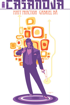
 CASANOVA #1
By Matt Fraction and Gabriel Ba
$1.99, 28 pages, Two-Colours
Reviewed by Christopher Butcher
WELCOME TO THE WORLD OF CASANOVA
His father Cornelius is the Director Supreme of E.M.P.I.R.E., an international task-force established in the name of maintaining peace, law, and order across the face of the Earth. His twin sister Zephyr is E.M.P.I.R.E.’s star agent, currently tasked to investigate a disturbance in the very fabric of the space-time continuum. The entire planet is under the Quinn family’s jurisdiction. So what does Casanova Quinn choose to do for a living? Read on…
So begins Casanova #1, and not in the text of the piece, but in a small bit of preamble tucked into the credits page on the inside front cover; your first clue that the material that surrounds the story will end up being just as important as the story itself.
Casanova #1 is an object, an objet d’art if you will. It’s growing increasingly rare that the monthly comic pamphlet is meant to be read or purchased for any other reason than fanboy necessity: the need to know what happens to your beloved character next. That raises the question of why a non-superhero-oriented title, hell, a non-Marvel or DC title would bother being launched on a monthly basis at all? To side-step that issue entirely, I’ll say that when the book’s objectness, its ‘single-issueness’ is as considered and successful as this the “whys†are less important. In an industry where the importance of the non-superhero pamphlet had to be forcefully, aggressively reclaimed by oversized, dust-jacketed, thick-papered waves of comics (see: Ignatz), the idea of launching a new ongoing series of pamphlets needs an ideology: a manifesto. Casanova as a series is designed to be read an issue at a time, enjoyed an issue at a time, and then perhaps considered as a whole after the fact. Comprised of 16 pages of story with a limited colour palette (one sickly shade of green and black and white), 5 pages of back-up material, and some lovely art and a straight-ahead story recap, the format itself is modeled after the perfect pop single: Short, sharp, and impossible to get out of your head. The success and authorial intent of the format of this book are why this is a review of the first issue rather than the first trade paperback; the format works. On his message board author Matt Fraction stated that “…any of the single issues of CASANOVA so far could theoretically function as whole-arc endeavors scattered across three, four, five, six 22-page chapters (at least that *I’d* read, which really is the only barometer I have). And I’d be okay doing that, were that the format we were in.†But it isn’t, and isn’t that a nice change of pace?
(As an aside, between the “Fell format†that Ellis & Templesmith’s Fell and Fraction and Ba’s Casanova publish in, the Ignatz books, Grant Morrison’s fantastic and flawed Seven Soldiers ‘modular storytelling’, and even DC’s 52, 2006 was a very good year for the reinvention of the floppy comic.)
In my reading of the series it’s the format—the presentation of the material—that defined it. While the first issue side-steps the 16-page imposition with a 28 page introductory story, the ideology remains intact: a great story, done-in-one, that gives you a helluva lotta bang for your buck. The first issue is the exact opposite of “all set-up,†the de-facto description of pretty much any new series launch. It also eschews the stylized in-media-res that substitutes for innovation in… pretty much any other new series launch (aside: I guess it’s technically in-media-res, but really it just feels like it begins at the beginning…). Instead? The comic treats you like you’re a grown-up. Admittedly, it treats you like the kind of grown-up who grew up on all the things that author Matt Fraction likes (super-spies, comic books, pop music, middle-brow sci-fi) but still, it’s refreshing for a comic to assume that when an obvious spy character is on a mission and things are going wrong that we don’t need detailed captions explaining the whys and wherefores. It asks the reader to have a little faith that everything will be explained in time, and by the end of the first issue it is: bravo. In fact, Fraction and artist Gabriel Ba go so far as to undertake a meta-narrative manoeuver on page two, having the characters pulled outside of the narrative to directly address the reader with information that is both inessential and colourful. It’s exactly the kind of information that might normally be clumsily inserted to dialogue or captions, that adds to the mood and tone of the piece. The meta-narrative effect is successful precisely because the book deals with things like parallel dimensions and alternate-earth versions of characters and events; Fraction is clearly banging the crap out of reader expectations on a giant anvil, and it’s disorienting as hell for both the characters and the reader, but it (again) assumes you’ll read all the way to the end of the book before making up your mind. A rare feat. Today I read an issue of Ultimate Spider-Man that was so unconfident in its emotional climax that it spelled it out on the cover, just in case you missed it.
…I don’t need to slam other comics to praise this one, but like I said this series has a strong “manifesto†vibe to it and I tend to fall in for those hook, line, and sinker. This is a dense comic book, the ideas flying fast and furious and even seemingly discarded. I commented recently that it took me three attempts to really feel like I “got†the first issue of this book because I didn’t commit enough of my attention to reading it. A lot of that is because there are just so many ideas being communicated to the reader. Offhand comments like “…designed by X.S.M.†or “the legendary Fakebook of the cosmos!†are tossed out at a rapid pace, with nary an appearance again in the issue. As I’ve said though, it does pay off down the line. We will find out who X.S.M. is in an issue or two, and that discovery and the story that accompanies it add layers of depth and understanding to the events of this first issue. It’s… rewarding.
Gabriel Ba’s visuals afford the same ingenuity: flying motorcycles, bug-shaped psyches, even the pattern on the bedsheets are all visual signifiers of a deeper and more considered world than usual. Ba brings a level of visual sophistication, class, and detail to the series that demands you pay attention to every carefully chosen little object or fashion tic. The reduced colour-palette and noir stylings of the art just seem to draw a deeper focus than the wash of most computer-coloured mainstream books… ah, but there I go making those nasty comparisons again. Suffice it to say, Ba’s work echoes Eduardo Risso and Mike Mignola in a loose and cartoony way that fans of either artist will appreciate, and that serves the story beautifully.
I’d be lying if I said that at the end of the first issue I wasn’t still a bit confused or unsure of where the series was going. It’s a bit like the first time you try sushi: your mouth likes it but your stomach needs a little while to make up its mind. I enjoyed great big parts of the series (if for nothing else on the first read, then for it’s audacity) but on later reads, particularly when the series is read on the whole, a larger picture is unveiled. A meta-plot for your meta-narrative. The seemingly slapdash nature of the concepts and throw-away lines in this issue are anything but; it’s all in there for a reason—even the stuff that doesn’t make sense and the stuff that contradicts the other stuff. Apparently you just can’t fuck with the space-time continuum and expect everything to come up roses, and this issue is akin to a snowball set rolling down a very large hill—it’s picking up new stuff all the way down, but the structure is still solidly constructed from everything that’s come before.
For those of you without the benefit of $13.93 to buy the whole series, those who might only be able to afford a risky single-issue purchase and are now concerned about the integrity of this single-issue, fear not: there’s an afterword! It deals mainly with the idea behind the series, about the format and the germs of ideas in Phil Spector singles and “Danger: Diabolik†and whatnot, but reading the afterword (or ‘backmatter’ as the ‘Fell Format’ creator Warren Ellis describes it), one gets the sense that this is not simply shit being thrown against the wall to see what sticks; there’s a plan and there’s six more issues coming and we hope you had a good time but tune in next month so I can blow your socks off again. The backmatter rounds out the offering, makes it a whole.
I have no doubt in my mind that this is all just too much for some people, but believe you me I was well and truly pacified when I closed Casanova #1. I was thoroughly on board, and if having a blog and valuing my opinion highly has taught me anything, it’s that you’ll be on board too.
– Christopher Butcher


 JUN063099Â BEASTS HCÂ 28.95
 You know what I love? Comics.